Geospatial data statistically represents items and occurrences in a specific geographical location. The occurrences can either be induced by man or natural. The geographical information can cover maps, the interconnection of locations, and more. Collected data is instrumental in various ways, including facilitating pinpoint predictions and guiding insightful decision-making. Studying geospatial data for a prolonged duration makes one understand why things happen where and when. However, the question has always been how an educational institution benefits from this data type. Here are some common ways schools utilize geospatial data.
Tools like Google Maps operate under geospatial analysis, and they help individuals find the fastest route to their destination. Such tools help students stay punctual in school, especially the new ones who are yet to learn more about the school. These applications blend in the virtual and real world, making them interactive and easy to operate. They also create easy and safe routes that students can use to school.
Furthermore, they can be used to trace hard-to-find students. The geographical information system uses a data system that operates after data entry and analysis. Some geospatial apps even monitor one’s routine, making it easy for students to stay organized and keep time. Remember, time management is a serious issue among students, and improperly managing time is one reason students get overwhelmed with assignments and ask, “Should I pay someone to do my essay uk?”
Marking Remote Learning Attendance
Institutions are embracing remote learning, and there is a need to streamline this learning mode to match up to the seriousness of attending a physical class. Therefore, institutions utilize the GIS to ensure students attend lessons offered online. Through GIS, lecturers can locate all students. The system gives an accurate location of every student during class time so that the student does not lie about their whereabouts. Monitoring students’ attendance using this system improves their performance since they will not be missing out on important lessons.
Monitoring Professionals
Educational institutions also use GIS to locate their professionals offering various services. Both students and the administration can use the geospatial system to locate professional services around the school. Colleges are big, with many offices available; therefore, the geospatial system minimizes the need to physically locate a lecturer or any other employees around the school since one can use their phone or tablet to find an individual and their specific location. The administration can also use it to track whether professionals in the institution report to work and areas where service is needed by teachers or other employees within the school.
Learning Tool
The geographical information system plays a significant role in developing learning processes. It is particularly essential for those taking geography since the GIS can navigate the environment and present comprehensive details we cannot see. It is also instrumental in helping students locate some of the major landmarks taught in class. Also, the system allows teachers to choose the best field trip locations without physical inquiries.
Some lessons may require a teacher to guide students on different location-based events. For example, when giving a lesson on “myths about legends from Egypt,” the teacher can prepare for the lesson without necessarily making a trip to Egypt. The geographical information system also applies to other subjects like mathematics and physics. For example, an instructor can use the system when providing lessons on the square area of a particular place in or out of school.
Rating College Safety
The safety of students and staff within the confines of the institution is vital. It is possible to monitor the security of a place manually; however, with the GIS, it is much easier and accurate. It makes monitoring various security patterns in the school compound and noting any suspicious activities possible. The GIS plays a primary role in monitoring and giving an alert of any natural disasters that are likely to occur within the school compound. A geospatial system makes it possible to monitor the population in an institution, which is also among the ways schools can improve their safety since any strange movement can be noticed and dealt with early.
Promoting Project-Based Learning
Most learning institutions use geospatial data to promote project-based learning. The geographical information system allows students to frame, identify, and solve problems. It improves an individual’s problem-solving skills in matters involving natural hazards, energy, and other issues we experience within our location. Project-based learning means active participation, which is a way to keep students more involved in class projects and real-world issues. Students engaged in project-based learning become great scientists and decision-makers in the various careers they will pursue.
Community Connection
Schools use GIS to help students connect deeper with their surroundings. Through the GIS, students and their instructors can engage in local discussions and develop solutions to issues experienced in their area. They can also take part in local planning. For example, if most students use bikes to get to school, they can suggest the development of a new bike trail. GIS also helps students collect local data, meaning they cannot run short of data during exams or research projects.
Monitoring Infrastructure Development
Going around physically to monitor infrastructure development can be quite tasking. However, with the geographical information system, college administrations can monitor the development around the school by following up on the new and existing buildings that may need repair. They also follow up on the usage of this infrastructure.
Final Take
We cannot overstate the use of GIS in school settings, seeing as it has made some activities in educational institutions less tasking. Most institutions embrace the technology since it extends even to remote learning. Features such as Google Earth present an augmented reality that can be used for demonstrations for remote and physical learners.
The geospatial analysis technology is represented in applications such as Google Maps, Google Earth, Mergin Maps, and much more. These applications help the administration and students create the best routes around school, monitor infrastructure and professional services, promote project-based learning, and more. Geospatial technology has experienced robust growth across various industries, and its impact has also been felt in the educational sector.
Uber, Google, Wendy’s, CDM Smith Inc, and Amazon – you couldn’t get a much more diverse set of organizations. A search engine, a fast-food chain, to an online retail store – these businesses might be diverse in terms of their operations, but they’re all linked by certain business practices.
That is, these top business players all utilize geospatial data to optimize their operations for a healthier bottom line. In this article, you’ll discover what geospatial data is and how it’s used by these top 5 businesses to gain a competitive edge.
Ready?
Let’s jump straight to it.
What is geospatial data?
Geospatial data is also known as place-based or location-based data, such as longitudes, latitudes, stress addresses, and postal codes. Geospatial data analysis collects, displays, and manipulates GIS – Geographic Information System – data like imagery, satellite photographs, and historical data. The aim is to collect, store, retrieve, and display vast amounts of information in a spatial context.
For instance, can you imagine life without GPS?
In this vein, you’ll likely remember buying a paper map to plan your routes from one place to another. This system was slower, hard work, and vulnerable to human error. Today, geospatial data has been a game-changer when it comes to providing location/place-based information. Whether it’s MapQuest, Pokémon Go, Google Maps, or the in-dash car navigation system, everyday citizens use geospatial data more than they know.
How do top businesses use geospatial data?
Just as we rely on geospatial information every day, leaders worldwide use geospatial data to guide them towards making the right decisions at the right time. With that said, let’s take a closer look at how Uber and other top businesses are using geospatial data to optimize their strategic decisions for efficient operations and sustained business growth.
Uber
In 2019, Uber brought in $14.1 billion in revenue, showing exponential growth from 2013 (where revenue equals $0.1 billion). Founded in 2009 by Garrett Camp, the organization has since grown into a disruptive tycoon that’s ripped up the cab industry by storm.
Central to its success comes geospatial technology.
With the Uber app, the user can request a cab. This user’s location is then taken and matched with the closest driver. The driver accepts this match and is guided by applying it to the user’s location to transport the user to their chosen destination. This entire process draws from the application’s geospatial data.
This isn’t the only way Uber uses geospatial data — there are countless others. For instance, the application identifies areas with the highest need for drivers and advises active drivers to be near those hotspots during high demand times.
Without geospatial data, Uber would not be the business disruptor it is today.
Google
Google is the goliath of the business world. In the third quarter of 2020, Google’s revenue amounted to $46.03 billion, up from $38 billion in the preceding quarter. Taking a good chunk out of this revenue comes from Google’s map application, which brings $4.3 billion a year.
Google maps has 154.4 million monthly unique users. And behind every map, there’s a much more complex system, the key to your queries but hidden from your view.
This more in-depth system contains the logic of places, all the left and right turns, freeway on-ramps, speed limits, traffic conditions, you name it. And to produce such a system, Google uses geospatial data provided by a third party to deliver digital maps and other dynamic content for navigation and location-based services.
Wendy’s
Square hamburgers, sea salt fries, and the addictive Frosty, this fast-food giant brought home $1.687 billion in revenue in 2020.
Wendy’s carefully researches locations, leveraging mapping software and census data (population information). The fast-food chain searches for sites with a high population and potential customers and looks at household demographics, average income, and nearby businesses.
But this analysis doesn’t stop when the right site has been found. Wendy’s continues to examine this geospatial data after construction at the given location. Before construction, prior construction results can then be compared to continuously tweak and improve their GIS analytics model and processes.
CDM Smith Inc
CDM Smith Inc is a global engineering and construction firm providing solutions in water, environment, transportation, energy, and other facilities. In 2015 the organization’s revenues totaled over $500 million, and one of the reasons for the success has been the organization’s use of geospatial data.
That is, for CDM Smith Inc, geospatial data provides design and engineering capabilities to create plans, layouts, and maps. GIS applications for design and engineering make use of both imaging and planning functions. Such functions mean geospatial data is commonly used in industries such as landscape engineering, environmental restoration, commercial and residential construction, and development. CDM uses geospatial data for environmental engineering and remediation projects.
Amazon
In 2019, the online retail platform, Amazon, reported a net income of $11.59 billion, up from a $10 billion U.S. net income in the previous year. To stay ahead of the curve, Amazon is always coming up with new and innovative ways of doing business. And one example is Amazon’s Prime Air drone project, expected to officially launch on August 31st, 2020.
By integrating GIS with Artificial Intelligence, it’s possible to fly drones over much larger distances than other previous attempts. Amazon has jumped on this bandwagon, delivering packages by drones. The aim is to deliver packages to customers in 30 minutes or less using unmanned aerial vehicles – drones – operational thanks to geospatial data.
Gain a competitive edge by using geospatial data
As technology advances, geospatial data is becoming more complex, with widening business potential. At the end of this article, we saw how Amazon is combining GIS software with Artificial Intelligence (drones) to expand the use of both. Does this represent the future of things to come regarding geospatial data?
Geospatial data analysis has the potential to:
Match consumer demographic data with spatial information about the places they live
Validate existing GIS data sets
Monitor and report weather
Survey habitats
Model landscapes
Assess disaster damage
While these are just a few examples, by combining geospatial data with AI, the possibilities of its use are expanding. To grasp a competitive edge, and be a top player in the business arena, dig deep and see how you can leverage geospatial data technology for your business operations.
GIS analysis uses geographic data to solve issues and make choices. It analyzes patterns and correlations using geography, computer science, and statistics. Geospatial data has affected environmental research, urban planning, public health, and transportation. However, the discourse community, the collection of individuals who share a language and purpose, can also influence geographical data discovery and growth.
Finding Opportunities
Funding and grants may help the discourse community shape geospatial analytic research. Varied organizations have different interests and aims, which might affect financing. With that being said, reading discourse community essay examples for college can be effective in understanding this matter. These articles are useful and informative for this niche enthusiasts. A public health discourse community may emphasize research on disease outbreak spatial distribution, whereas transportation discourse communities may favor transportation network optimization. These objectives affect research and methodologies.
The Role Of PGIS
Traditional PGIS uses paper maps, interviews and questionnaires to maintain spatial properties. Data is gathered to be searched and analyzed by computer GIS software and disseminated through computer-generated maps. Specialized knowledge and class- and gender-segregated local wisdom are used. It gathers various sets of participants from the community and non-governmental institutions. It is built on elevated levels of stakeholder engagement in the stages of spatial learning, judgment, and action. Technological agencies and politicians might debate concerns and exchange ideas here.
Influence On Certain Data
Geospatial analysis data and tools are affected by discourse organization. Data availability and accessibility vary per discourse community, as do data sources and formats. Geospatial analytic software and techniques may also vary by discourse community. Environmental research groups may choose open-source software, whereas urban planning teams may prefer software with a better visualization. And these are great examples of how certain data can influence discourse units.
Shaping The Guidelines
Discourse unity can play a role in shaping the standards and guidelines that are used in geospatial analysis. And that’s important for every student to remember. Varying communities have different data quality, accuracy, and precision expectations. And that might affect standards and recommendations. The discourse collective may also shape geographic data and analysis of best practices and ethics. Personal data utilization in spatial thinking may vary by discourse community.
Education And Practice Of Geospatial Analysis
Finally, professional organizations and certification programs may help the GIS community educate geospatial analytic experts. Professional groups may help members network and improve professionally, as well as set industry standards. Certification programs can assist geospatial analysts to show their expertise and create industry standards. They are based on prolific data that can bring positive results. People might work together alongside these courses. In the end, education is the core of success. And geospatial analysis is not an exception.
Sharing The Ideas
The discourse community sets research, communication, and cooperation standards that affect geospatial analysis. It may provide criteria for gathering and analyzing geographical data, standards for making maps and other visualizations, and methods for sharing and utilizing spatial information. It promotes geospatial analysis through sharing ideas, information, and skills. Discourse community members may exchange research results, debate new methods and technologies, and cooperate on projects via conferences, journal papers, and other means.
Setting Research Priorities And Providing Support
The discourse community can influence the direction of research in geospatial analysis by identifying and prioritizing important questions and issues that need to be addressed. This can help to ensure that research efforts are focused on areas of greatest importance and relevance. The discourse community can provide resources and support to professionals working in the field, such as access to data, software, and other tools. This can help to foster the development of new techniques and technologies and support the advancement of geospatial analysis.
Conclusion
The discourse community helps geospatial analysis evolve. It affects research paper topics, information transmission, and professional training. Geospatial analysis practitioners and scientists must interact with the discourse collective to remain abreast of field advancements and best practices. It’s all in them putting in enough effort.
Welcome to the wild and wonderful world of geospatial data visualization! If you’re anything like us, you find that maps just have a certain je ne sais quoi that makes them endlessly fascinating. But let’s be real, maps aren’t just for daydreaming about far-off places. They’re powerful tools for understanding and communicating information about the world around us. And that’s where geospatial data comes in.
At Tamoco,we’re used to map vizualizations with our cutting-edge data collection and analysis techniques. We’re providing high quality data that goes into creating those mesmerizing maps we all love so much.
But whether it’s our data or data from another source, what do you do with it? That’s where visualization comes in, and that’s exactly what we’re here to talk about today.
We’ve scoured the depths of the internet and consulted with experts in the field to bring you a comprehensive list of 20 different methods for visualizing geospatial data on a map. Whether you’re a data scientist, a GIS specialist, or just someone who appreciates a good map, we’ve got something for you.
Method 1: Heat Maps
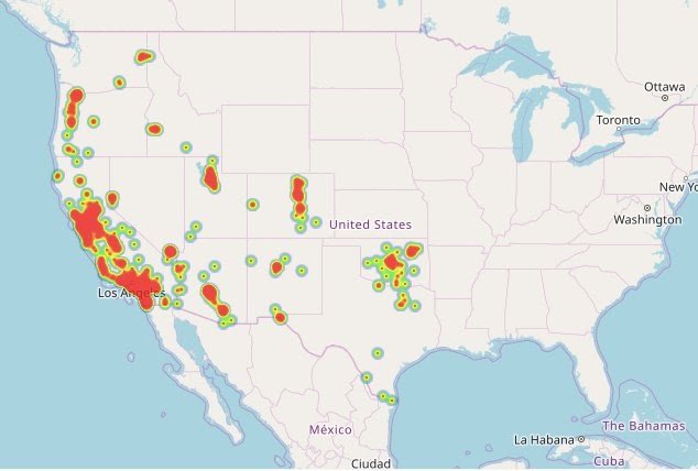
Alright, a heat map is like a choropleth map’s cooler and more sophisticated cousin. Both use colours or shades to represent different values or value ranges, but where a choropleth map uses discrete cells constrained by geographical or political boundaries, a heat map presents them as a smooth and seamless spectrum.
This makes heat maps perfect for uncovering hot spots and low concentrations of a variable with more precision. But, just like anything worth doing, this precision comes with a price. Heat maps often require converting discrete data points into a continuous spectrum via algorithms, which can compromise on accuracy.
Use case: Smart Cities
Let’s say I’m looking to understand where to build a new cycle lane in a city. By generating commuting data and using it to build a heat map, I can identify hotspots where cyclists will cause a lot of disruption. Using this data, I can see the areas which need alleviating.
Example of heat maps
This is a great map of the distribution of restaurants across the US.
These maps use different shades of colour to represent different values or value ranges within geographical or political boundaries. So, in a nutshell, it’s like a colouring book for data nerds where each country, state, or region gets its own colour.
Creating a choropleth map is a piece of cake. You start with a base map, and then you use different shades of colour to represent different values or value ranges within geographical or political boundaries.
But before you get too excited, it’s important to remember that choropleth maps also have their limitations. They don’t give you any information about the magnitude of the variable, and they can be misleading if the geographical or political boundaries aren’t well-defined. But when used correctly, choropleth maps can be a powerful tool for understanding the distribution of a particular variable within geographical or political boundaries.
Use case: marketing
Let’s say you’re a marketer, and you want to see which states in the US have the highest sales of your product. You could use Tamoco’s data to create a choropleth map that shows the visits to your stores by state. The states with the highest sales would be coloured differently than the states with the lowest sales.
Example of a Choropleth map
The classic example which can be seen below is a population density map.
Up next on the geospatial data visualization train is the Proportional Symbol map. These maps use symbols, such as circles or squares, to represent different values or value ranges, and the size of the symbols is proportional to the value of the variable.
Use case: analysis
For example, let’s say you’re a scientist, and you want to see the distribution of a certain species of birds across a region.
You could use a dataset that shows this distribution to create a proportional symbol map that shows the number of sightings of the species by location. The locations with more sightings would have bigger symbols than the locations with fewer sightings.
Proportional symbol maps also have their limitations. They can be misleading if the symbols overlap and they don’t give you any information about the geographical distribution of the variable.
Example of a Proportional Symbol Map
Again it’s a political example where the breakdown of votes in each state are shown by using a pie chart as a symbol on this map of the US.
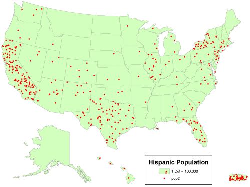
Let’s have a little look at the next visualization type in this post: the Dot Density Map. These maps are used to represent a variable within a certain area. The more dots within an area indicate that the variable is more abundant.
Use case: health
If you work in public health, then you might need to understand the distribution of a disease across a geographical region. You could use Tamoco’s data to create a dot density map that shows the number of cases of the disease by location. The locations with more cases would have more dots than the locations with fewer cases. In this example, The dots can be colour-coded to represent different types of cases, for example, severe or mild cases.
The limitations of this kind of map are usually that they can be misleading if you don’t have enough detail in the map. There is also no magnitude of the variable in a lot of cases.
These maps are game changers. They take a little bit of everything and make it into a scrumptious feast for the eyes. It blends the beauty of contour lines with the detail of a choropleth map to give you an explosion of information. The lines represent equal values, and as they get closer, the values get higher. Think of it as a topographical map but more impressive.
Use case: meteorologist
Well, let us imagine you’re a meteorologist, and you want to study the precipitation patterns in your city. With an isarithmic map, you can show the rainfall distribution across the city in an easy-to-understand manner. The closer the lines, the higher the rainfall. It’s a visual representation of the data that brings it to life.
Not only do isarithmic maps make data more digestible, but they also add a touch of artistic flair to your presentations. No longer do you have to stare at boring bar graphs or pie charts. With an isarithmic map, you can show the world’s location or geospatial data in all its splendour.
Let’s take a look at a real-world example of flow maps in action. Say you’re the CEO of a large logistics company and you want to visualize the shipping patterns of your fleet of trucks. With a flow map, you can plot the origin and destination of each shipment, creating a web of lines that show the routes taken by your trucks. The thicker the line, the more shipments moved along that route. This allows you to easily see the busiest routes, where bottlenecks might be, and where your fleet is most efficiently moving goods.
Use case: logistics
Let’s take a look at a real-world example of flow maps in action. Say you’re the CEO of a large logistics company and you want to visualize the shipping patterns of your fleet of trucks. With a flow map, you can plot the origin and destination of each shipment, creating a web of lines that show the routes taken by your trucks. The thicker the line, the more shipments moved along that route. This allows you to easily see the busiest routes, where bottlenecks might be, and where your fleet is most efficiently moving goods.
Example of a flow map:
Method 7: Density-Equalizing Maps
Have you ever seen a map that looks like a distorted mess, leaving you feeling discombobulated? That’s where Density-Equalizing Maps come in to save the day! These maps make sure that regions with higher density are represented as larger in area, as opposed to just appearing larger because they’re closer to the center.
Use case: city planning
One classic use case of Density-Equalizing Maps is in the field of population demographics. By accurately visualizing areas with higher population density, policy makers and urban planners can make informed decisions about urban development, resource allocation, and emergency preparedness.
Dot maps are quite beautiful when you think about it. A great representation of multiple data points – that use dots to represent individual parts.
The density of dots in a single location represents the concentration of data points in that area. Each dot represents a single instance of data, so it’s a very, very effective way to visualize the distribution of data.
These maps are even more useful when you have huge amounts of data to understand and want to avoid excess clutter on your map. They are great for visualizing data over a large area, such as a city or country, as they allow you to see patterns and relationships that may not be immediately obvious with other mapping methods. They are also a fantastic way to visualize changes over time, as you can create a series of maps that show the evolution of the distribution of your data.
Use case: store planning (retail)
Let’s say you want to understand every Starbucks in your city. A dot map would be a great way of plotting this on a map. A single dot equals a single Starbucks. The more dots you see in an area, the higher the distribution of Starbucks in the area.
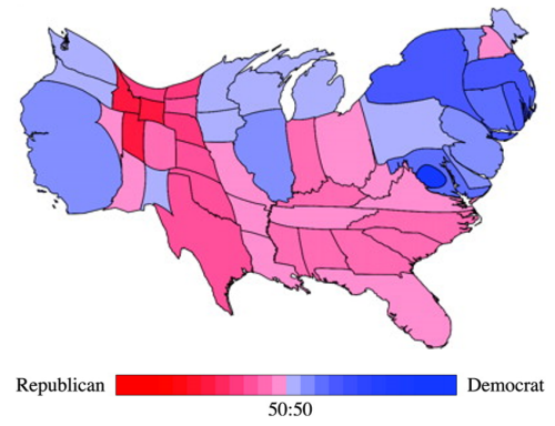
Cartograms are a phenomenal way to visually represent geographical data. Instead of using traditional maps, cartograms distort the size of geographic regions to reflect the magnitude of the data being displayed. Think of it as a funhouse mirror for geospatial/location data, where the size of each region is adjusted to reflect its importance in the data set.
Cartograms provide a unique and fun way to represent geographical data, while still being a powerful tool for visualizing and understanding complex data sets. Whether you’re a data analyst, geographer, or just someone who loves maps, cartograms are sure to add a new dimension to your understanding of the world around you.
Use case: government
An example of a use case for cartograms can be seen in the representation of population data. A population cartogram would adjust the size of each region to reflect the size of its population, with larger regions representing areas with higher populations. This type of representation can quickly bring attention to the areas of the world with the largest populations and help to identify the potential locations for targeted campaigns or resource allocation.
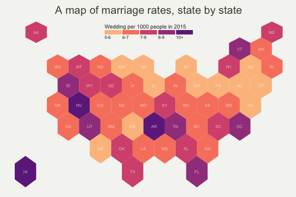
Now we arrive at the world of Hexbin Maps! Picture a world where data isn’t simply scattered like confetti on a map, but is instead grouped into beautiful, hexagonal shapes. That is the wonder of hexbin mapping.
Hexbin maps, as their name suggests, involve aggregating data into hexagonal bins. This is particularly useful when you have a large volume of data points to represent in a small space, and want to avoid clutter. The size of the hexagons represents the density of data points in a given area.
In a nutshell, hexbin maps are a way to take data overload and turn it into a chic and digestible form. They’re perfect for situations where you have large datasets and want to make quick and easy comparisons between areas
Use case: Tamoco
So, let’s take Tamoco for instance. We collect location data from millions of devices every day. Now, imagine if we had to display the data points for each device on a map. It would be a bit of a mess mess! But, with hexbin maps, we can aggregate the data into hexagons, effectively summarizing the data in a visually appealing and meaningful way.
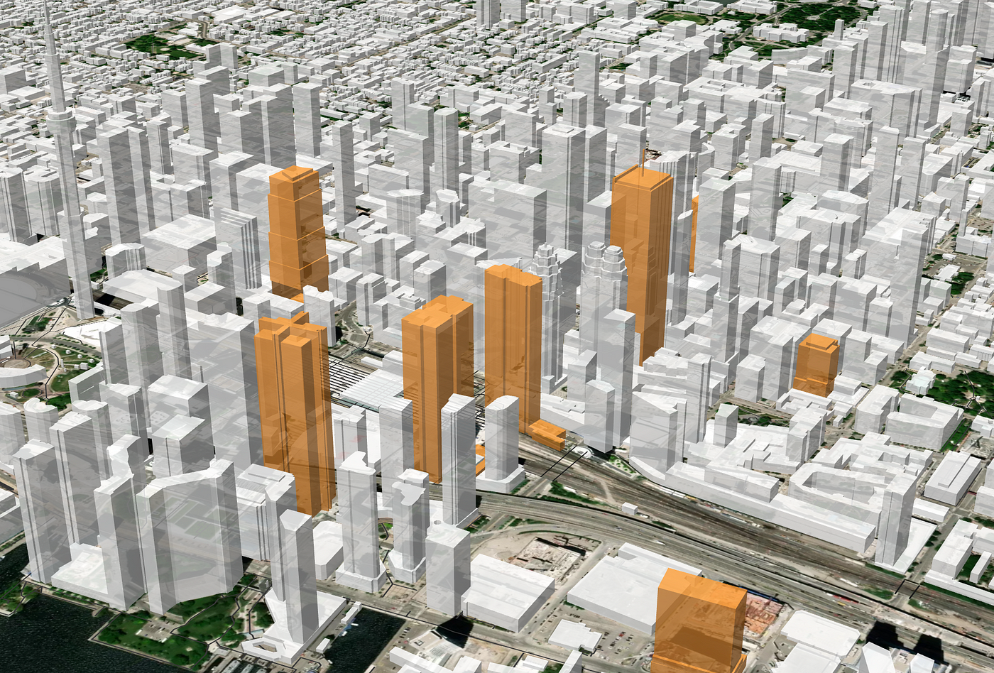
Oh, now we’re getting into some serious geospatial magic. 3D maps take mapping to a whole new dimension (literally!) and can bring a level of realism to your data visualization that’s simply unmatched.
Think about it, with traditional 2D maps, you’re stuck with a flat representation of the world. But with 3D maps, you can now see buildings, terrain, and other features in their actual, three-dimensional form. This allows you to better understand the relationships between various elements and how they interact in the real world.
Use case: real estate
Let’s say you’re a real estate developer and you want to showcase your latest project to potential buyers. You could create a 3D map that allows people to explore the virtual city, walk down the streets, and see the buildings from all angles. This not only gives potential buyers a better sense of the project, but it also provides an immersive, interactive experience that’s simply not possible with 2D maps.
These maps allow you to explore and interact with data in a way that’s both intuitive and engaging. With interactive maps, you can drill down into the details, play with filters, and uncover hidden patterns and insights. It’s like having your very own personal geospatial detective ready and waiting to solve any mapping mystery.
This is exactly what we provide to many of our clients here at Tamoco. We take complex geospatial data and provide our customers with a detailed interactive map where they can filter and change the view depending on their current needs.
Use case: real estate
For example, imagine you’re a real estate agent with a portfolio of properties. You can use an interactive map to showcase your listings, highlight the best neighborhoods, and provide a wealth of information to potential buyers. With an interactive map, you can easily filter properties by price, location, square footage, and more. This helps you to tailor your pitch and demonstrate why your properties are the best investment. Your clients will love the ability to explore the data for themselves, and you’ll love how it streamlines the sales process.
This method uses graduated symbols to represent the dataset – it assigns different sizes of symbols to different values in the data. This size can be related to a metric of your choice in the datset itself.
These maps are a great way to visualize data that has a large range of values, such as population or income. By using different symbol sizes, you can effectively convey the information without overwhelming the viewer with too much detail.
Use case: government
An example of a use case for graduated symbol maps is to visualize population density in cities. By using graduated symbols, you can see which areas have the highest population density and which areas have the lowest population density. For example, in a city with a high population density, the symbols would be large, while in a city with a low population density, the symbols would be small.
It’s time to get a little bit fancy with our maps. Have you ever stumbled upon a choropleth map and thought to yourself, “Well this is nice, but it doesn’t quite capture the real deal”? Enter dasymetric mapping, the map lover’s answer to the choropleth’s limitations.
Dasymetric mapping, also known as “value-by-alpha mapping”, takes the idea of choropleth mapping and adds a little extra oomph by incorporating detailed boundary information to create more accurate and nuanced maps. This method allows you to control the boundaries of your map areas and assign data to specific areas within those boundaries.
At Tamoco, we’ve used dasymetric mapping to help companies better understand the distribution of their customer base. By mapping out population density and overlaying customer data, we’ve been able to identify areas with a high concentration of customers and make more informed decisions about where to open new locations.
Use case: population density
A prime example of where dasymetric mapping can come in handy is when mapping population density. In a typical choropleth map, population density may be portrayed on a large scale, with a single color representing the entire area of a city or even a whole country. But with dasymetric mapping, you can get down to the nitty-gritty by mapping population density at the block or even the building level!
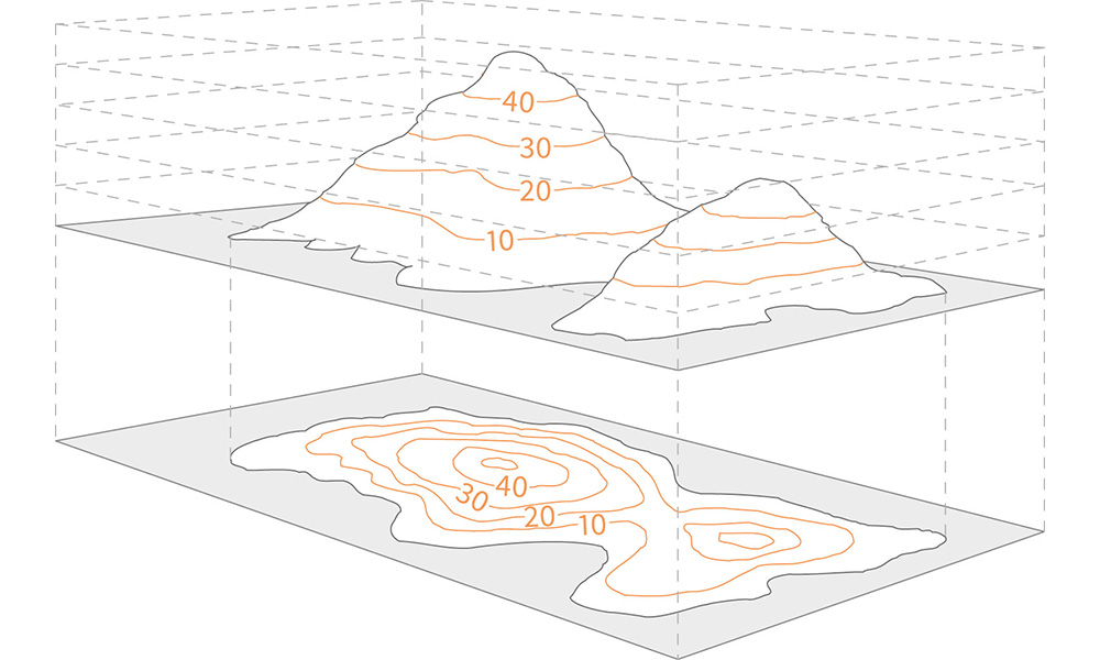
The concept behind these maps is simple – these maps depict changes in elevation with contour lines, much like those you’d see on a topographic map. But why settle for 2D when you can have the whole shabang? With Contour Maps, you can visualize the changes in elevation as a 3D representation of the terrain.
Use case: agriculture
One stellar example of where Contour Maps can be a real game changer is in the world of agriculture. Picture this: you’re a farmer, and you want to maximize the yield of your crops. But, you don’t want to leave anything to chance, you want to know exactly how the elevation of your land affects the growth of your crops. Enter Contour Maps. These bad boys can help you determine the slope of your land, which in turn can help you determine the best irrigation and drainage strategies for your crops. You can even take it a step further and integrate satellite imagery with your Contour Map to get an even more accurate representation of your land.
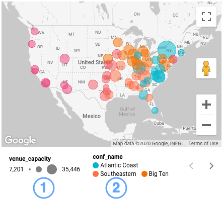
In a nutshell, bubble maps are maps that use bubbles (or circles) to represent data points. The size of the bubble is proportional to the magnitude of the data being represented, while the color and position of the bubble provide additional metadata or information.
Use case:
Bubble maps are an excellent way to showcase data that has both a geographical and a numerical component. For instance, let’s say you’re trying to visualize the distribution of billionaires across the world. You can use bubble maps to show not only where the billionaires are located, but also how many there are in each location. The bigger the bubble, the more billionaires in that area.
Well, that was fun, wasn’t it? A lot of maps for you to dig into, each with its own quirky strengths and charming quirks. But with so many options, how do you choose the right one for your geolocation data?
So let’s start by asking what you’re trying to accomplish. Are you simply looking to display raw location data, or do you want to do something related to footfall to visits? Do you want to highlight patterns and correlations, or are you more interested in conveying information through symbols and shapes?
Once you’ve got a handle on your end goal, consider the data you’re working with. Is it dense or spread out? Does it have many dimensions, or just a few? Do you need to represent change over time or just a snapshot in time?
And finally, think about your audience. Will they be looking at your map on a screen or holding a printout in their hands? Are they data experts, or will they need a little extra guidance to understand your message?
No matter what method you choose, the key is to ensure your map is visually appealing and easy to understand. After all, the most beautiful map in the world is useless if no one can figure out what it’s trying to say.
At Tamoco, we understand the importance of maps and the role they play in visualizing and communicating data. That’s why we offer a wide range of mapping options for you to choose from, each with its own unique style and capabilities.
So why not give Tamoco a try and see what amazing maps you can create with our data today?
Marketers have long since stopped catering to the lowest common denominator. Instead, they’re now leveraging the copious amounts of data we create online to find just the right audience for the products they’re promoting.
Geospatial data is indispensable for modern customer segmentation and profiling. What exactly is geospatial data? How does it benefit marketers’ efforts? Why is taking pains to protect such data crucial? This article explains everything you need to know.
What Is Geospatial Data?
Any data that allows one to determine and track the location of a person or object is geospatial. GPS images of a local road network or a Google Maps overview come to mind first. However, different entities can also collect geospatial data on individuals. This can include their place of work and residence but also go beyond.
Some intrusive apps may collect real-time location data on users. The reasons might be innocuous, like showing you the best restaurants or museums in an area. Others could collect more sensitive information like which places you take your dates to or how much you work out and where.
How does marketing benefit from geospatial data?
Location-based customer information is a boon to marketers for several reasons.
They may use it to improve customer segmentation based on habits and activity levels. Such data is also useful in scoping out the competition and tailoring campaigns to account for local preferences better. Given enough time and quantity, geospatial data can help marketers predict and plan for future demand and launch timely, more successful campaigns.
How Can Marketers Safeguard Geospatial Data?
While it comes with a wealth of understanding for marketers to draw on, geospatial data is also rife for exploitation by bad actors. Inadequate protection measures can lead to data breaches and theft, exposing potentially millions of customers and prospects. Even if the data you collect is anonymized, it doesn’t take much to infer more about an individual with their location and movement habits.
Here are the steps any responsible marketing team should take to reduce the risks.
Prioritizing data quality
Geospatial marketing depends on collecting large amounts of data. However, that’s just the prerequisite. Analysis of this data is what yields the insights marketing strategies depend on, so that’s what you should focus on storing.
Even if the strongest cybersecurity methods somehow fail, you can still protect people’s anonymity by not storing any information that could compromise it in the first place. The correct approach is to focus on bulk data, which is useful for uncovering and taking advantage of local patterns and opportunities.
Even so, some marketing efforts are most successful when interacting with people on a personal level. In that case, being transparent and upfront about the data you collect is crucial. Asking for consent and highlighting how their contribution builds trust while also making your efforts compliant with data protection regulations.
Secure access controls
Not everyone in your organization needs or should have access to the geospatial data you do end up storing. Setting up access controls is a way of minimizing threats from malicious insiders. It also ensures that only trusted actors who have business handling the data can interact with it.
Creating a hierarchy with different user classes and corresponding privileges is best. Very few trusted people have privileged access, while everyone else should only be able to view or alter data within the scope of their responsibilities and current projects.
A comprehensive password policy
Role-based access works only if a unique and complex password secures each account. That’s rarely the case if you leave it up to employees since most will reuse passwords or go with variations on familiar favorites that take little effort to guess, for the convenience’s sake.
Implementing an enterprise-level password manager is an elegant and cost-effective solution to this. Its greatest strength is the ability to create and securely store strong passwords not just for geospatial data access but for any account all employees could need.
Besides that, multifactor authentication is an extra security measure industry-leading managers let you set up for each password. It further enhances account security by requiring a separate code alongside the password whenever someone tries to log in from an unknown device.
Data backup
A single copy of something as relevant as geospatial data is a considerable risk. Ransomware attacks are on the rise. A single successful one is enough to make the data inaccessible unless you comply. There’s also the matter of power outages and various hazards that could render the hardware you store the data on useless or inaccessible.
Keeping at least two more up-to-date copies of geospatial data is advisable. One can be on a disconnected physical drive, which will protect it from cyberattacks. Using cloud storage for the other offers access control while mitigating physical risks.
Encryption at rest and in transit
Securely storing geospatial data is important, but not enough. Encryption adds another layer of protection that makes it impossible to make sense of the contents. Even if someone were to steal the encrypted data, it would be useless without a decryption key.
Local encryption takes care of data at rest but is also vulnerable when shared. A marketing team can have members working from home or somewhere else in the world. They all need a secure means of accessing geospatial data and sharing their work, which business VPNs deal with expertly.
Connecting through a VPN ensures encrypted data sharing and complete anonymity. That way, no one can track interactions between team members and wouldn’t be able to benefit even if they could. This one solution is a viable alternative to the safeguards companies set on their main network while protecting anyone using a VPN’s encrypted tunnel wherever they’re connecting from.
Needless to say, market is brimming with a lot of options when it comes to VPNs. Yet, businesses need a thorough comparison before they commit to a provider. In this case, sources like VPN comparison table comes in handy to make decision processes effective and easier.
Conclusion
Geospatial data has become an indispensable wellspring of information for marketers. Knowing how to collect and protect such data guarantees its continued relevance and usefulness for many more upcoming campaigns.
Geospatial data comes in handy for knowing what kind of things are present at a particular place and how they look and function. With such location intelligence, companies can make more informed decisions.
By the end of this article, you will understand:
How companies using geospatial data to offer a more personalized customer experience
How businesses increase their operational efficiency and profit margins through geospatial data
Geographic Information System (GIS) and Global Positioning System (GPS) analyze geospatial data. This analysis can help you map and integrate location information of a particular place, object, or person with proper description.
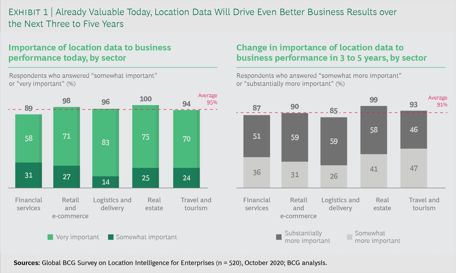
According to the Global BCG survey, 95% of executives across the globe consider mapping and geospatial data critical for achieving desired business goals.
Various Ways That Companies Are Leveraging Geospatial Data
Your business’s location plays a critical role in its success or failure. Geospatial data can help you understand the market condition of the prospective site. The data can also give you insight into the customers’ preferences and help you predict how your business will perform in a particular area.
Before analyzing the geospatial data for site selection, ask yourself:
Are you selecting a site for a new store?
Do you want to move, renovate or close your existing store at a particular location?
In both cases, you need to analyze the following geospatial data:
Competitors
Do you want your business to stay near your competitors? If you’re going to attract more customers, select a site where your competitors set up their business.
Customers often look for variety when shopping. This, in turn, can entice your competitor’s customer base to visit your store. It will further increase your store’s visibility and sales.
For instance, Burger King took competition heads on by targeting McDonald’s outlets in its proximity. Here’s how the campaign worked:
The campaign “Escape the Clown” was inspired by the American horror movie “It Chapter Two.”
The outlet compared the evil character of the movie to McDonald’s clown mascot and asked people to escape the clown.
All this took place while people were on the premises of McDonald’s.
Burger King went the augmented reality way. It placed a secret ad within the McDonald’s movie magazine where an article on “It Chapter Two” was present.
Further, Burger King went ahead and leveraged location on social media. It took the help of Facebook and Instagram by setting up a calendar to target people visiting McDonald’s. Visitors instantly received a message from Burger King asking them to download its app. Visitors instantly received a message from Burger King asking them to download its app. In general Instagram for small businesses has been al lot of help.
Once the visitors downloaded the app and scanned the said article, they received a coupon for the signature Whopper burger at the Burger King. People could redeem the voucher and get the burger for a cent.
The catch was the limited time of the coupon. The Burger King app used geolocation to provide people with the nearest route to McDonald’s outlets.
Thus, as the campaign’s name itself suggested, people ran out of McDonald’s to redeem the coupon, thereby escaping the clown.
Customer’s Interest
Different bases of your customers in other locations might be having different points of interest. You can set up your store in a place where you have the highest customers at a particular point of interest. GIS and GPS will help you analyze this geospatial data and map out that location. These points of interest (POI) range from parking lots, restaurants and gas stations.
For instance, consider you want to set up an e-commerce store and find a large chunk of your customer base visiting a particular restaurant in an area. Such POI can be an ideal business location for you. “In this process, you will need to compare Wix vs WordPress to pick the best one for your eCommerce brand.”
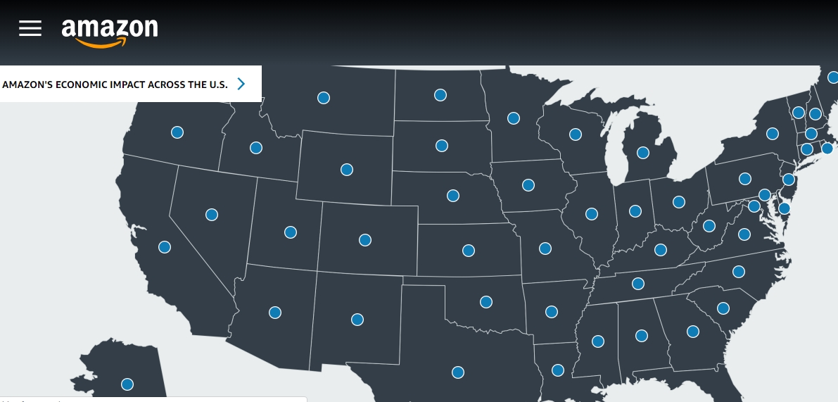
Here’s another example from the e-commerce giant Amazon. It made good use of the geographic data of authors, sellers, and developers on the United States map. This data came in handy when it launched its first physical bookstore.
Amazon stocked books in its bookstore based on the reading interests of the people residing in its proximity. As a result, Amazon went ahead and set up plenty of Amazon Go Stores. It also created a significant economic impact across the United States.
Level of Traffic
You can also leverage the traffic data while finalizing the store location. You should set up your store in an area where your target customers have high foot traffic. It will increase your store’s visibility and sales.
For instance, if you run a convenience store, placing it near a gas station and corners of the street will give you more footfall. Convenience stores provide easy access to essential utilities such as snacks and toiletries. So, people often visit these stores during commuting.
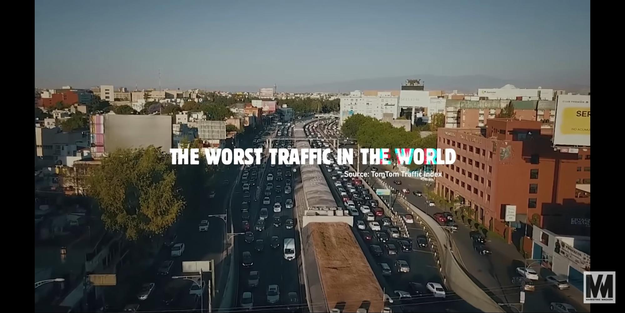
Further, if you have a knack for creativity, you can use the traffic data as Burger King did. Mexico has the worst traffic in the world. People there are stuck in the traffic for as long as 5 hours.
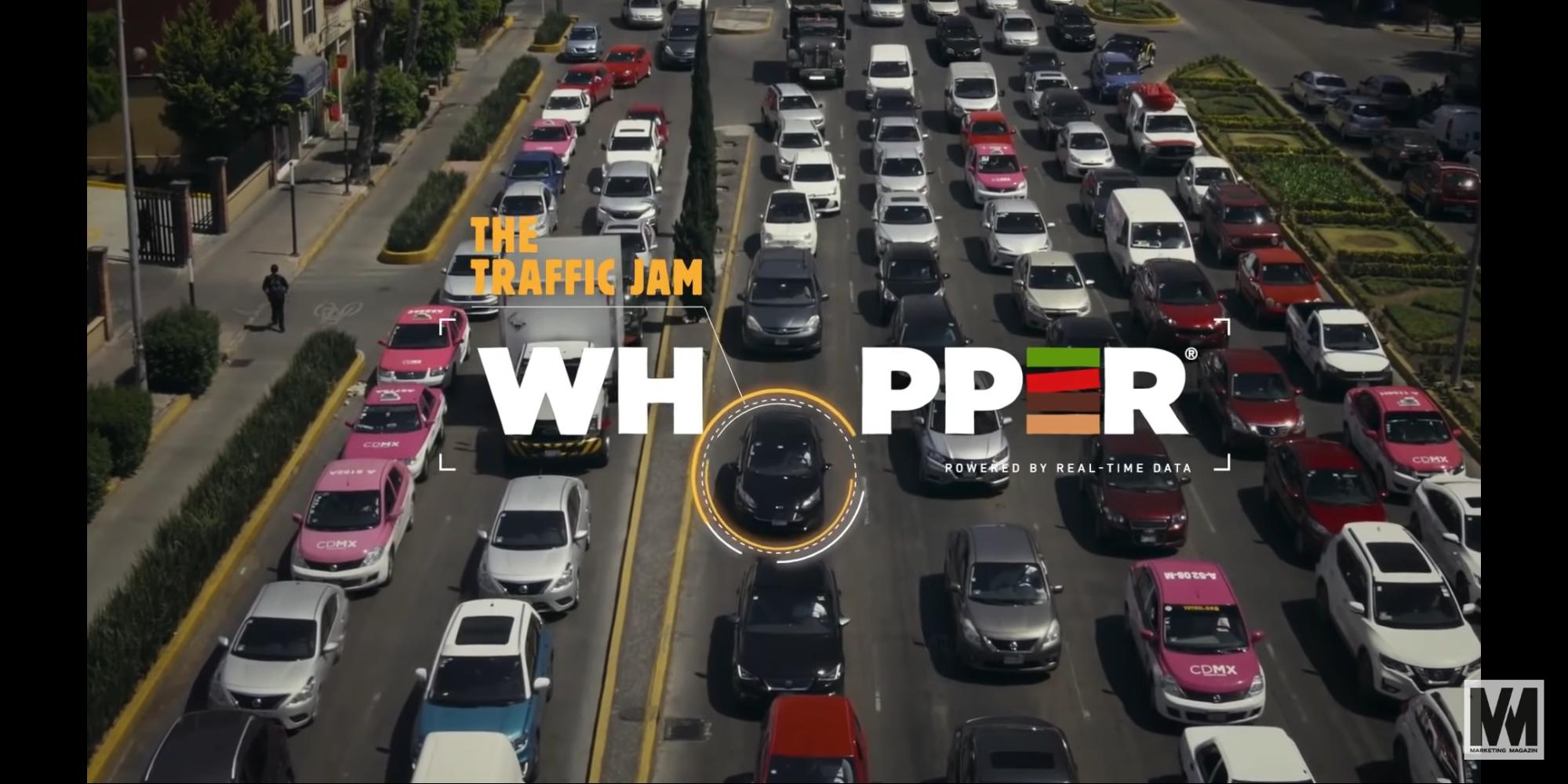
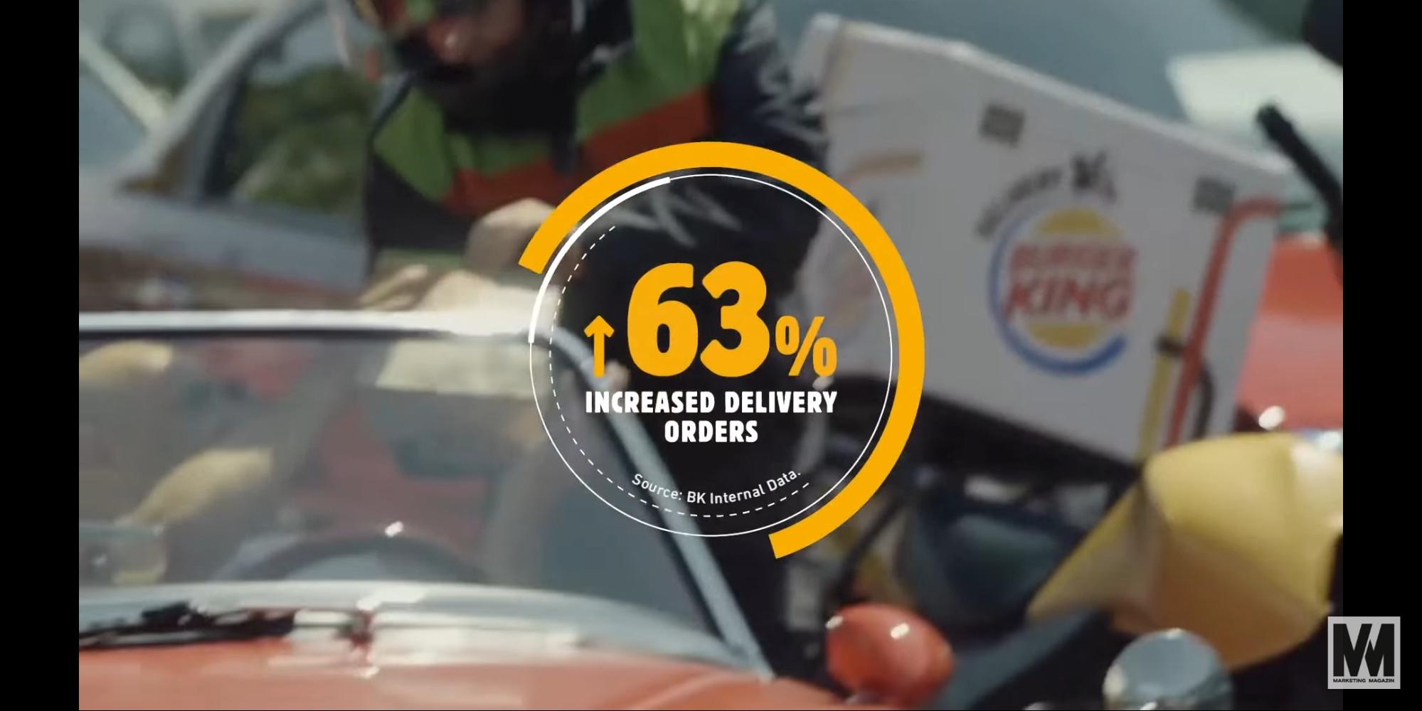
Burger King took it as an opportunity to increase its sales and came up with the campaign “The traffic jam whopper.” Here are some screenshots from an explainer video Burger King created.
It combined the location data with beacon technology and sent personalized push notifications to customers stuck in traffic.
As a result, the campaign accelerated their sales by 63%.
Optimizing Supply and Distribution Route
If you are into the supply and distribution business, geospatial data such as satellite imagery can help you optimize your routes. Besides, you will also witness a considerable decrease in logistics costs.
For instance, if you run a small grocery outlet and deliver fresh fruits and vegetables to grocers in varied locations, you can use GIS and GPS to get insights on following geospatial data:
When were the fruit and vegetables plucked from the field?
Which routes did the inventory vehicle take for the products to reach their destination?
What was the quality of the products after their arrival?
If your products encounter problems such as stale fruits and vegetables, you can easily track the whole process. It will give you an in-depth insight into the loopholes from which you can instantly take corrective measures. This, in turn, will ensure that your future product deliveries are top-notch.
You can take the example of Amazon here. It launched its Amazon Prime Air Drone Project in 2020. The project worked on the combination of artificial intelligence with GIS. With this integration of geospatial data, Amazon delivers products to customers within a record time of 30 minutes. Now, that’s a brand strategy that helped Amazon fulfill its long-term goals of improving customer experience.
Better Customer Segmentation and Targeting
You can make your business successful through customer segmentation and targeting. This can help you create personalized marketing campaigns for your customers.
With GIS mapping, you can find out your customers’ consumption patterns. But, since these data contain sensitive information about your customers, you must keep it secure from cyber-attacks. When sharing it online, don’t forget to use a Virtual Private Network (VPN) to encrypt your geospatial data.
Which product/service are they using regularly?
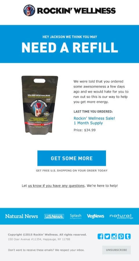
If they consume a particular food supplement, send them a reminder email or a push notification a few days before their supplement ends. Do it the way ROCKIN’ WELLNESS does with its reminder email.
Are they changing their buying preferences?
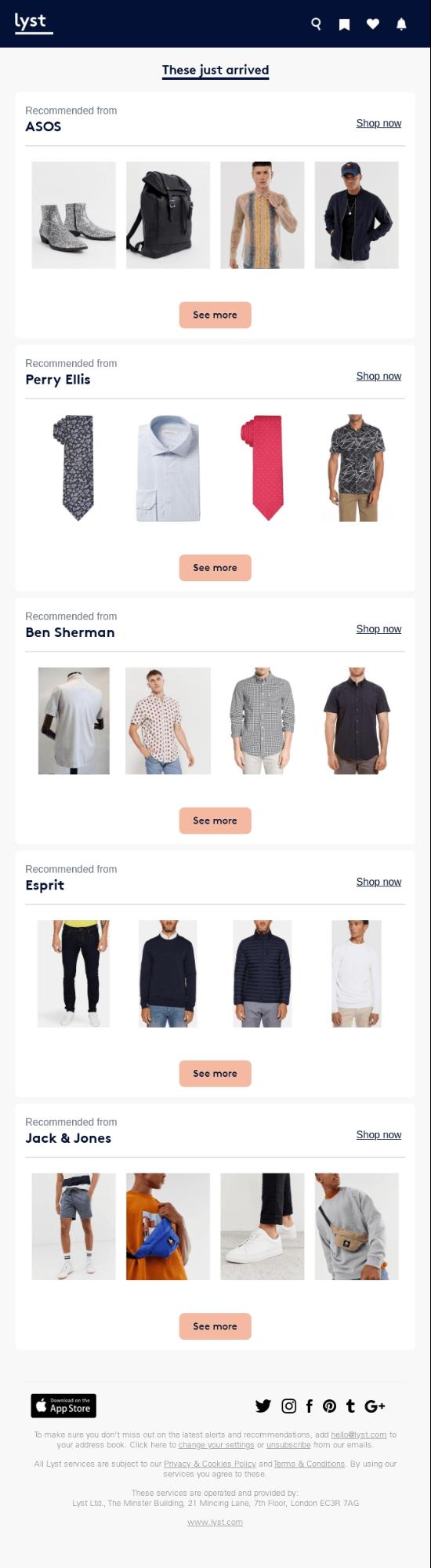
If they were buying custom hoodies from a particular brand, but are browsing other brands now, send them a recommendation email for similar products in new brands. Take some inspiration from Lyst to craft a compelling recommendation email.
If they have switched to your competitors, retain them through loyalty programs, discounts, and coupons. A cost-friendly hack would be to send them through push notifications and emails with a discount offer to increase your conversions while keeping the cost low and improving your Return on Investment (ROI) by a whopping 10%.
Further, you can also try retaining your customers by organizing giveaways on social media.
Take a look at how Facebook did a phenomenal job with giving giveaways.
Make sure to have a verified social media account to establish credibility in front of your customers.
Publishing infographics depicting how your products and services are better than your competitors can also allure your customers to come back to you.
Analyzing Future Marketing Trends
From customer’s information to sales target data, you can analyze these data and come up with the following results:
Improving your sales strategy based on the consumption pattern of consumers
You can also take some inspiration from Walmart’s geospatial strategy. It makes use of a variety of location-based technologies to improve customer experience. These technologies include geo-fencing, store map features, and artificial intelligence. Let’s take a look at how they implement this high-end location-based strategy:
To improve navigation through a Walmart store, the brand came up with a store map feature on its mobile app. The segment contains unique layouts of all the Walmart outlets in the US. They further provide the exact location of each product present in each outlet.
On Black Friday, Walmart came up with an exclusive Black Friday Store Map. It gives customers the precise location of the most exciting Black Friday deals. The map highlights the high-demand product locations with the help of color-coded maps. These maps were accessible by clicking on the “map your deals” button.
Walmart manages its vast inventory with the help of AI-backed robots. It installed automatic shelf scanners in its various outlets. These scanners have cameras that monitor the items present on the shelves. If any product goes out of stock, or if the labels or pricing are wrong; these scanners alert the store manager.
So, you see, how geospatial data helped Walmart take its customer experience to another level?
Now, let’s take another example of how Neil Curie, an investment banker analyst, predicted Walmart sales using satellite data.
He gathered satellite data of 100 Walmart stores and analyzed the number of vehicles in their parking lot every month. It gave him a clear idea about the regular flow of customers in the retail outlet.
He further used the regression technique. It helped him figure out how the vehicles in the parking lot were in direct proportion to the Walmart earnings. With this correlation, he was able to predict the sales of Walmart for the next quarter year.
Now that’s how you use geospatial data like a pro. Imagine doing the same for your business and skyrocketing your earnings!
Amazon, Walmart, and Burger King are the top brands that are leveraging geospatial data.
In a nutshell, geospatial data can help you understand your customers and competitors better. This, in turn, will help you develop top-notch marketing strategies and speed up your sales and revenue.
You might not realize how geospatial technology is transforming property tax administration, but it’s making a significant impact. By leveraging Geographic Information Systems (GIS), you can enhance accuracy in property assessments and improve transparency in tax processes. This technology not only identifies discrepancies but also fosters a more equitable taxation system. As you consider the implications of these tools, it’s worth exploring how they can reshape the landscape of property tax practices and what that means for stakeholders involved. What changes could this bring to your understanding of property value and taxation?
Understanding Geospatial Technology
Geospatial technology encompasses a range of tools and techniques that analyze and visualize spatial data, providing essential insights for various applications.
You’ll find that this technology integrates geographic information systems (GIS), remote sensing, and global positioning systems (GPS) to capture, store, and manipulate spatial information. By employing GIS, you’re able to layer different data sets, which helps in identifying patterns and relationships that might otherwise remain hidden.
When you utilize remote sensing, you’re gathering data from satellites or aerial imagery, allowing you to monitor land use, assess environmental changes, and evaluate property characteristics effectively. GPS technology further enhances your ability to pinpoint exact locations, ensuring accuracy in data collection and analysis.
Understanding these components is vital, as they collectively enable you to create detailed maps and models that inform decision-making processes.
Whether you’re analyzing property boundaries, zoning classifications, or infrastructure placement, the integration of these technologies provides a solid foundation for effective spatial analysis. By harnessing geospatial technology, you’re not just gathering data; you’re transforming it into actionable insights that lead to improved outcomes in property tax administration.
Benefits for Property Tax Administration
The integration of geospatial technology considerably enhances property tax administration by streamlining processes and improving accuracy in assessments. By employing Geographic Information Systems (GIS), you can visualize spatial data and analyze patterns that directly influence property valuations. This capability allows for more precise property delineation, minimizing disputes and ensuring equitable tax assessments.
Moreover, geospatial technology aids in identifying underreported properties or discrepancies in tax records. When you utilize satellite imagery and aerial surveys, you can uncover changes in land use or property improvements that mightn’t have been reported, leading to increased tax revenue. This proactive approach not only enhances compliance but also strengthens public trust in the tax system.
Additionally, geospatial tools facilitate better communication among stakeholders. By creating interactive maps and dashboards, you can present data in an accessible format that allows taxpayers to understand assessment methodologies and results. This transparency reduces confusion and enhances taxpayer engagement.
Ultimately, the adoption of geospatial technology fosters a more efficient, transparent, and fair property tax administration system, benefiting both the governing entities and the community at large. By leveraging these tools, you position your administration for greater accuracy and efficiency in property taxation.
GIS in Property Assessments
Precision in property assessments is greatly enhanced through the use of Geographic Information Systems (GIS), which allow assessors to analyze spatial data with remarkable accuracy. By integrating various data layers—such as land use, zoning, and property boundaries—you can visualize and interpret complex information efficiently. This capability enables you to identify trends and anomalies that would otherwise remain hidden.
GIS facilitates the evaluation of property characteristics, including size, topography, and proximity to amenities. For instance, you can assess how location affects property values by overlaying demographic data with real estate trends. This spatial analysis helps you establish fair market values based on extensive evidence, reducing the likelihood of disputes.
Moreover, GIS tools streamline the data collection process. Automated updates and real-time data integration guarantee that your assessments reflect current market conditions.
Enhancing Transparency and Accountability
In today’s property tax landscape, enhancing transparency and accountability is essential for fostering trust between assessors and the public. By leveraging geospatial technology, you can provide clear, visual representations of property data that demystify the assessment process. Geographic Information Systems (GIS) allow you to overlay property boundaries, historical tax data, and market trends, presenting a thorough view that stakeholders can easily understand.
You can improve communication with taxpayers by making this data accessible through online platforms or interactive maps. When citizens see how property assessments are calculated and where their tax dollars are allocated, they’re more likely to engage positively with the process, especially when systems like VAT Refund for Non-GCC Residents in KSA demonstrate a commitment to equitable and accessible financial practices.
Additionally, geospatial technology enables you to track and document changes in property values over time, reinforcing the rationale behind assessment decisions.
Moreover, integrating geospatial data into your workflows can create an audit trail of decisions made during the assessment process. This documentation not only holds assessors accountable but also provides a basis for addressing any concerns raised by the public.
Ultimately, by prioritizing transparency through geospatial technology, you can strengthen public trust and promote a more equitable property tax system.
Identifying Discrepancies in Taxation
Utilizing geospatial technology greatly enhances your ability to identify discrepancies in taxation. By integrating geographic information systems (GIS) with property tax data, you can visually analyze patterns and anomalies that may indicate underreporting or overvaluation. This technology allows you to pinpoint irregularities that traditional methods might miss.
Visualize spatial relationships between properties and tax assessments
Compare property characteristics against market trends
Identify areas with inconsistent tax rates or valuations
With tools like GIS, you can overlay various data layers, such as property boundaries, land use, and historical tax records. This enables you to conduct a thorough analysis, revealing discrepancies that require further investigation.
For instance, by examining changes in land use, you might uncover properties that have been underassessed due to zoning modifications.
Moreover, geospatial technology can assist in identifying tax equity issues, ensuring that similar properties are taxed uniformly. By leveraging this technology, you not only improve the accuracy of tax assessments but also foster a fair taxation environment.
In turn, this enhances compliance and revenue generation for local governments, leading to a more efficient property tax administration system.
Future Trends in Geospatial Technology
The future of geospatial technology in property tax administration is poised for significant advancements, driven by innovations in data analytics and integration.
You’ll likely see enhanced tools that leverage big data, allowing for more precise assessments of property values. Predictive analytics will enable you to forecast trends in property development and market fluctuations, ultimately refining tax assessment processes.
Moreover, the integration of machine learning algorithms will automate the identification of anomalies in property data, reducing the time required for manual reviews. As you adopt cloud-based geospatial platforms, real-time collaboration will become more feasible, enhancing communication among tax assessors and stakeholders.
Additionally, expect an increase in the use of mobile applications that empower field assessors with immediate access to geospatial data, improving efficiency on-site. The incorporation of augmented reality (AR) could also revolutionize how you visualize property characteristics and potential changes, leading to better-informed decisions.
Lastly, as privacy concerns grow, you’ll need to address data security and ethical considerations in your implementation of geospatial technologies. Staying ahead of these trends will be essential for optimizing property tax administration and ensuring equitable taxation practices.
Conclusion
Incorporating geospatial technology into property tax administration isn’t just a trend; it’s a necessity. Some may argue that traditional methods suffice, but these methods often lead to inaccuracies and inequities. By leveraging GIS, you enhance accuracy, streamline processes, and foster public trust through transparency. As you embrace these tools, you’ll not only improve assessments but also guarantee fair taxation practices. The future of property tax systems lies in informed decision-making powered by advanced geospatial insights.
Unless you’ve been living under a rock, you should be aware of the fact that the online casino industry is more popular and used than ever. When the world of online gaming really took center stage, many people thought that the likes of businesses like casinos, which were reliant on footfall traffic and brick-and-mortar establishments would die out, however, this could not have been more untrue.
Online casinos have done an excellent job of moving from their physical locations to shifting to the digital world. It’s a bit of a random industry, the casino industry, however, they have done a stellar job with the transition and this should be applauded and analyzed so that other companies can perhaps do the same. With the use of geospatial information, the casino industry is at the helm of innovation. This article aims to shed light on all of the most important factors therein.
Geospatial Components
The act of using geospatial components to improve the livelihood of an online business is crucial to its success. The world of geospatial aspects is rather large and the online casino industry made sure to partake in a wide variety of aspects.
The first was looking at trends. For online casinos to do well, they needed to know what kinds of trends their players were portraying. Through looking at the data, trends were clearly evident. You could easily see that players preferred to play at home or on the go. That means that online casinos needed to create interfaces that worked well on at-home laptops and desktops, whilst also creating an excellent mobile version of the same thing, for those who preferred to play whilst on the go. To see a detailed example of casinos that did this effectively, read the full review here, where you’ll find how they mastered both desktop and mobile user experiences.
Beyond this, through geospatial aspects, another thing was looked at, which was mapping. Through the figures and the stats, it was clear to see that online players were playing from all over the world. This presented online casinos with their next challenge, namely how to make sure that the games that were published were available across many different countries. The biggest issue here was the legality of play. As an online casino, you have certain steps and regulations that you must follow to obtain your licensing. Each country has its own regulations, so if you want your game to be available in Japan and Germany, there are different rules and protocols that you must follow. Online casinos managed to bridge this but learning about the rules and regulations in certain countries and then first showcasing their games to those countries that were easier to get into. Then they moved toward the arduous road of obtaining the correct licenses for the countries that were a bit more tricky.
User safety was the third big thing that came about with geospatial mapping. You see, the online casino world is now one of the safest forms fo gaming, in terms of the safety tools and features that they have online. This was encouraged during the safety process of the geospatial mapping process, where they noticed that many people did not engage with games because they thought they were unsafe. This gave online casinos the cue to invest in digital safety, ensuring that the privacy of their players remained at the forefront of importance.
Success Abounds
Beyond the specific geospatial steps, other trends and needs were also discovered by looking so closely at the data sets. The first was that players wanted to be able to engage in a variety of games. One of the biggest trends was boredom – online casinos felt bored about always playing the same five games over and over again. This gave online casinos a great idea, namely to create a wide variety of games that players could engage with.
Furthermore, in the spirit of game variation, it was also noticed that players wanted more advanced features and gaming protocols, through artificial intelligence (AI) and virtual reality (VR). This is a trend that not all online casinos will be able to replicate, as it comes with quite an intense budget, however, it is something that was noticed during the statistics process.
In addition to this, again, player safety was paramount. As mentioned above, online casinos started to realize that if they wanted to experience any level of success, they needed to make sure that players felt safe. This meant that when you logged into a game, you felt as though you could trust the online casino you were logging into.
Player Responsibility
If you are a player and all of these changes sound interesting to you and make sense, that’s great but one thing has to be noticed. Through all of this research that online casinos have done, they have managed to create games that are far more in line with your needs and wants than ever, creating a lot of temptation. This means that you need to be as responsible as can be when it comes to how you play. You have to make sure that you have a strict budget, both time-wise and financially so that you don’t lose yourself in a game that was designed to get you in.
Well, there you have it, everything that you need to know.
Geospatial technology has the potential to completely revolutionise the way educators and authorities approach school security efforts. Using high-level combinations of satellite-based, drone-captured and indoor positioning geospatial data, stakeholders are able to build accurate and adaptive depictions of properties and physical resources, the analysis of which helps staff plan informed incident responses.
Additional data, including crime records and internal incident reports, can be leveraged against this information to help stakeholders identify hotspots, vulnerabilities and areas in need of attention, as well as inform the planning of low-risk evacuation routes and instructions for emergency responders.
Geospatial data can be updated in real-time, enabling leaders to adjust plans in response to unfolding events, with admins able to access live insights via secure smart devices and computer systems. This live, informational approach to school security shows promise in enhancing emergency preparedness and incident response capabilities, enabling leaders to promote safe schools through geospatial data.
What is geospatial data?
Geospatial data is information that describes the characteristics and physical properties of objects and infrastructure in a specific location on the Earth. Geospatial data is collected in a number of ways, including through live satellite imaging, weather data, census data, digital records and information collected by Internet of Things (IoT)-enabled environmental sensors like occupancy/sound detectors.
Geospatial data associated with multiple sources can be combined and collectively analysed within a unified Geospatial Information System (GIS). By feeding data into a dedicated GIS, admins are able to physically map real-world locations and adjust visual representations of select spaces in response to real-time information, offering a holistic view of combined physical resources and unfolding events.
How geospatial data improves school security
Geospatial analysis is commonly used to help solve challenges in education, with mapping tools and geographic information deployed in educational settings to improve learning outcomes, but GIS may also be effectively deployed as a school safety and security-focused data collection and analysis tool.
Combining live indoor positioning data collected by IoT sensors with high-quality satellite imagery and crime reports within a bespoke GIS provides school security teams an interactive and accurate picture of key physical resources. This information can be used in a number of ways, both to improve the way preventative measures are developed and to enhance live incident responses using accurate insights.
Examples of GIS-enhanced school security measures include:
Evacuation planning: GIS analysis can be used to plan and adjust evacuation routes for minimal risk of detection by viewing infrastructure from all angles to understand threat factors.
Emergency communications: GIS data can be communicated to emergency responders to help them adjust plans in response to live events, for example, if a gunshot detector is tripped near to a primary evacuation point teams can be updated instantly and informed of new plans.
Crime data analysis: Local crime reports can be fed into GIS platforms to gain insights into beneficial security improvements, helping leaders to ensure resources are used appropriately.
Student safety: GIS data collected by IoT sensors can be used to identify issues like vaping, smoking, absenteeism and fighting, enabling staff to address risks promptly and effectively.
Building management: Converting written records of floor plans and layouts into GIS data helps property managers to optimise building management plans and systems, enabling staff to investigate vulnerabilities in a digital environment to limit the impact of exploitable faults.
Summary
Geospatial technologies provide stakeholders the ability to better understand how physical spaces are used, both under normal circumstances and during emergencies, enabling staff to adjust operations in response to high-quality insights. When deployed alongside school security systems, GIS tools assist staff in identifying latent vulnerabilities quickly and effectively to promote safer school environments.
In the evolving landscape of academic research, geospatial data has taken center stage as a valuable resource. However, just like traditional sources, it’s imperative to give due credit when incorporating these into your work. Proper citation isn’t merely a formality—it’s an ethical obligation to uphold the integrity of the research community. This article delves into the nuances of effectively citing geospatial data sources, ensuring your research remains both credible and commendable.
In the realm of ethical research, proper citation of geospatial data sources holds paramount importance. Researchers must navigate the dos and don’ts of referencing geographical information to ensure the integrity of their work. The meticulous practice of acknowledging data origins not only upholds academic honesty but also provides a clear trail of verification for readers and fellow researchers.
When citing geospatial data sources, the dos encompass a series of essential steps. First and foremost, it’s imperative to accurately identify the origin of the data, whether from maps, satellite imagery, or geographical databases. Additionally, providing context to the data’s relevance within the research framework enhances its credibility. Furthermore, adhering to the appropriate citation style, be it APA, MLA, or others, ensures consistency and ease of reference for readers. As the foundation of ethical research, these dos guide scholars in giving due credit to data providers and maintaining the transparency and trustworthiness of their work. For added confidence in the originality of your research, you can always check plagiarism on Gradesfixer, a reliable tool that aids in verifying the uniqueness of your content before publication. Directly copying information without proper citation is a practice to avoid at all costs.
Top 6 tips for Ethical Research
Do: Keep Track of Every Source The life of a student is hectic—I get it. Between college parties and cramming for exams, who has the time? But, when it comes to citing, be that squirrel collecting every acorn. Every data sample, every map, every piece of info—keep a record.
Don’t: Eyeball It Don’t just guess where your data came from. And please, don’t just slap on a generic link hoping it’ll pass the sniff test. Be precise. If you got it from a specific page or topic, make sure you cite it that way.
Do: Know Your Source Look, we all love a shortcut. I mean, who doesn’t? But when it comes to geospatial data, you can’t just say “I found this map somewhere.” Dive deep, get to know your source inside out. Was it written by experts? Is it from a credible database? Knowledge is power, folks.
Don’t: Assume It’s a Free Game Just because data is online, doesn’t mean it’s free to snatch. Would you take someone’s pizza just because they left it on their table? I hope not! Treat geospatial data the same way. Make sure you have permission to use it, especially if your research is going to be published.
Do: Use Formal Citation Methods Alright, I know I said keep it chill, but when it comes to actual citations, it’s time to put on that suit and tie. Whether it’s APA, MLA, or whatever your college digs, make sure you’re citing geospatial data the formal way.
Don’t: Forget the Details Geospatial data is tricky. It’s not just about “who made it?” but also “when was it made?”, “how was it gathered?”, and “who funded it?”. These deeds might seem minor, but trust me, in the world of academia, they’re as essential as a good slice of New York cheesecake.
It’s a brave new world out there with geospatial data giving us insights we never imagined. But like any tool, it’s about how you use it. And in the world of academia, that means giving credit where it’s due. It’s not just a matter of respect, but of trust. When others read your work, they’re placing their trust in you to be honest about where you got your info. So do yourself and the academic community a solid: do your due diligence, cite properly, and always check your work. Because in research, as in life, it’s the little details that count.
Wrap-up
Alright, champs, here’s the lowdown. Geospatial data is dope—it can turn a drab essay into a masterpiece. But with great power comes great responsibility. Treat that data with respect. Cite it properly. Be sure you’re not accidentally ripping someone off. Run your work through a plagiarism checker, keep it clean, and rock on!