The transportation industry faces numerous challenges that disrupt the seamless movement of people and goods. Logistical complexities, inefficient route planning, and escalating costs collectively impede the sector’s efficiency, negatively impacting commuters, businesses, and consumers alike.
To address these issues, policymakers and transport sector leaders can leverage data analytics to enhance the core components of the transportation sector. Data analytics offers powerful solutions that revolutionise the transportation management process, offering industry stakeholders the following benefits:
Real-Time Route Optimisation
Traditionally, planning routes for fleets of vehicles involved relying on static schedules and forecasts. However, these often lead to inefficiencies and delays when faced with dynamic factors such as traffic congestion or unexpected road closures. With the advent of advanced data analytics techniques, the process of route planning has dramatically evolved. Today, transportation managers harness the power of big data to continuously monitor and analyse a myriad of variables that influence travel times and conditions. This includes immediate traffic updates, weather forecasts, historical patterns, and even social media feeds for immediate reports on incidents affecting roadways. Leveraging these diverse data sources and employing sophisticated algorithms enables transportation operators to swiftly compute the most efficient routes for vehicles in transit.
For instance, logistics companies can utilise data-driven transportation management solutions to anticipate traffic patterns and adjust delivery routes accordingly to avoid bottlenecks and minimise idle time. This not only reduces fuel consumption and operational costs but also enhances delivery speed and reliability. Moreover, real-time route optimisation contributes to sustainable practices by minimising organisational carbon footprints. Unnecessary mileage and idle time are reduced, resulting in less emissions released into the atmosphere.
Improved Maintenance and Asset Management
Another significant area where data analytics is revolutionising transportation management is in maintenance and asset management. Vehicle maintenance schedules were often based on periodic inspections or mileage milestones, which could lead to either over-maintenance or insufficient upkeep—both of which impact operational efficiency and safety. With the integration of data analytics, transportation sector stakeholders can adopt a proactive approach to maintenance by equipping vehicles with sensors that monitor various performance metrics (e.g., engine health, tyre pressure, and fuel efficiency) in real time. Predictive analytics algorithms can analyse these data streams to forecast maintenance needs accurately, recommending servicing based on actual usage and performance rather than arbitrary schedules. This predictive maintenance strategy not only extends the lifespan of vehicles but also minimises downtime — thus improving fleet performance.
Furthermore, data-driven insights into asset management enable organisations to optimise fleet composition and allocation. Analysing usage patterns can help transportation managers right-size their fleets and ensure that the right number and types of vehicles are deployed where and when they are most needed. This leads to cost savings through reduced capital expenditure on unnecessary vehicles and improved efficiency in resource utilisation.
Enhanced Passenger Experience
Across various modes of transportation,the ability to gather and analyse vast amounts of data is revolutionising how services are delivered and perceived by users. Transportation providers can examine historical data on passenger volumes, travel patterns, and seasonal trends to better anticipate peak times and adjust service levels accordingly. This allows for smoother operations, reduced overcrowding, and improved scheduling accuracy, leading to less waiting time and greater convenience for passengers.
Real-time analytics also enable operators to provide timely and accurate information to passengers. Whether it’s updates on departure times, gate changes, or service disruptions, passengers can stay informed through mobile apps, digital displays, or automated announcements. This transparency builds trust and satisfaction among passengers, who are likely to appreciate being kept informed and empowered to make informed decisions about their travel plans.
What’s more, data analytics can be used in personalising the passenger experience. Transportation providers can use data collected from customer preferences and behaviour to tailor their services and offers to their customers’ individual needs. For example, airlines can offer personalised travel recommendations based on past bookings, while public transport operators can suggest alternative routes or modes of transport based on current traffic conditions and user preferences.
Safer Transport Services
Transportation operators can harness data from various sources and apply advanced analytics to the safety of their services. They can use onboard sensors, GPS tracking, and even video surveillance to ensure their drivers are following the rules of the road. Analysing the data enables them to identify risky behaviours and issues such as speeding, harsh braking, or fatigue. This can lead to timely intervention, thereby promoting safer driving practices and reducing the likelihood of accidents.
Better Transportation Infrastructure Development
Through the power of data, transportation planners and policymakers can make informed decisions that optimise infrastructure investments, improve connectivity, and enhance overall mobility within communities. They can easily identify areas of high traffic density and inefficiencies in current road networks, enabling them to employ targeted interventions to alleviate congestion and improve traffic flow. Examples of these solutions include road expansions, traffic signal optimisation, or the introduction of alternative transportation modes like bus rapid transit (BRT) systems, cycle lanes, and rail systems.
Moreover, data analytics facilitates predictive modelling for future transportation needs based on population growth projections and economic trends. By forecasting future demand for transport services, planners can anticipate infrastructure requirements and allocate resources effectively. This proactive planning ensures that transportation networks can accommodate future growth while minimising disruptions and cost overruns.
Data analytics is revolutionising transportation across the globe. It’s giving policymakers, transport sector leaders, and even transportation operators the tools to make significant improvements in the efficiency, safety, and sustainability of their transportation management processes. With the proper use of data, the transport industry can build a positive future and meet the evolving needs of communities.
Geospatial analysis is a powerful tool for visualizing and understanding geographic data. It enables us to make connections between different types of geographical information, such as population density, land use patterns and climate change. By applying statistical techniques to the data sets obtained from remote sensing platforms and terrestrial surveys, we can gain insights into how our planet works and uncover hidden trends in the environment.
What can GIS be used for?
This knowledge can be used for a variety of applications, including urban planning, environmental protection, public health initiatives or resource management. Geospatial analysis also helps us gain a deeper understanding of natural disasters, such as floods or hurricanes, by providing an interactive way to study their effects on society at large. In fact, it’s a very common topic to study at universities. However, it’s quite complicated too. So if you were given an assignment on GIS and you need help with it, check the latest tech tools for students. For example, you can use a summary generator for essay that will reduce your time spent on writing. As a result, you will have a chance to spend more time reading about GIS than writing about it.
In short, geospatial analysis provides a powerful means to better understand our world, helping us make more informed decisions about how to manage and protect it.
What are the benefits of geospatial analysis?
Using geospatial data in analytics offers a variety of potential benefits, including improved accuracy and more in-depth insights. Geospatial data can be used to take into account the physical location of events or objects being studied in an analysis. Thus, it provides contextual information that is impossible to deduce from other kinds of data sources.
Geospatial data can aid disaster relief efforts by allowing organizations to track the movement of people, supplies, or equipment in real-time. It can also provide valuable insight into traffic flow patterns and subtle environmental changes through satellite imagery. In addition, geospatial data can help companies better understand their customer base by mapping out where customers live and how they interact with the company’s products or services.
Why GIS in education matters
GIS is an essential tool for understanding our constantly changing world. Through its mapping tools, GIS promotes spatial literacy: awareness of how physical and human phenomena are related to geography. This type of knowledge is increasingly necessary in today’s interconnected world, where decisions made in one location can have a global impact.
The use of GIS in education has been linked to improved academic performance, critical thinking skills, problem-solving abilities, and increased engagement with learning activities. Students who learn about geography through GIS experience more success on tests that measure their geographic knowledge. By combining complex data sets from different sources into interactive maps, students better understand the relationships between data points and gain valuable insights into the trends shaping our planet.
GIS also teaches students to look at data from multiple perspectives, encouraging them to think analytically and challenge assumptions. This type of critical thinking is essential for making informed decisions about the future of our planet. As GIS technology continues to evolve and expand, it will remain a vital tool for educating the next generation’s problem-solvers and innovators. GIS in education helps students develop the skills they need to become responsible global citizens who can make meaningful contributions to their communities and the world at large.
By providing students with an understanding of geography and its related phenomena, GIS helps create an awareness of the role that physical location has on human behavior and decision-making processes. Students gain an appreciation for how the environment can influence our lives and how human actions can shape the earth’s future. As GIS continues to play an important role in education, its potential to inform and educate future generations is immense. In a rapidly changing world, GIS tools are essential for helping students understand their place in it. With access to up-to-date datasets from around the globe, GIS provides invaluable insight into our planet’s current state as well as its possible futures.
Therefore, GIS should be recognized for its importance in education and offered as part of any comprehensive geography curriculum. It is through this kind of instruction that students will gain the knowledge they need to make informed decisions about their own pathways and those of our ever-changing world.
In conclusion
Employing GIS in classrooms and other educational settings is an essential step towards equipping our students with the knowledge they need to make meaningful contributions to society. By leveraging GIS’s mapping tools, educators can provide students with a better understanding of spatial relationships and better equip them to tackle the challenges of tomorrow. Whether it be analyzing population trends or studying natural phenomena such as climate change, GIS provides a valuable platform for teaching students about their place on this planet and how their individual actions can have far-reaching impacts.
Uber, Google, Wendy’s, CDM Smith Inc, and Amazon – you couldn’t get a much more diverse set of organizations. A search engine, a fast-food chain, to an online retail store – these businesses might be diverse in terms of their operations, but they’re all linked by certain business practices.
That is, these top business players all utilize geospatial data to optimize their operations for a healthier bottom line. In this article, you’ll discover what geospatial data is and how it’s used by these top 5 businesses to gain a competitive edge.
Ready?
Let’s jump straight to it.
What is geospatial data?
Geospatial data is also known as place-based or location-based data, such as longitudes, latitudes, stress addresses, and postal codes. Geospatial data analysis collects, displays, and manipulates GIS – Geographic Information System – data like imagery, satellite photographs, and historical data. The aim is to collect, store, retrieve, and display vast amounts of information in a spatial context.
For instance, can you imagine life without GPS?
In this vein, you’ll likely remember buying a paper map to plan your routes from one place to another. This system was slower, hard work, and vulnerable to human error. Today, geospatial data has been a game-changer when it comes to providing location/place-based information. Whether it’s MapQuest, Pokémon Go, Google Maps, or the in-dash car navigation system, everyday citizens use geospatial data more than they know.
How do top businesses use geospatial data?
Just as we rely on geospatial information every day, leaders worldwide use geospatial data to guide them towards making the right decisions at the right time. With that said, let’s take a closer look at how Uber and other top businesses are using geospatial data to optimize their strategic decisions for efficient operations and sustained business growth.
Uber
In 2019, Uber brought in $14.1 billion in revenue, showing exponential growth from 2013 (where revenue equals $0.1 billion). Founded in 2009 by Garrett Camp, the organization has since grown into a disruptive tycoon that’s ripped up the cab industry by storm.
Central to its success comes geospatial technology.
With the Uber app, the user can request a cab. This user’s location is then taken and matched with the closest driver. The driver accepts this match and is guided by applying it to the user’s location to transport the user to their chosen destination. This entire process draws from the application’s geospatial data.
This isn’t the only way Uber uses geospatial data — there are countless others. For instance, the application identifies areas with the highest need for drivers and advises active drivers to be near those hotspots during high demand times.
Without geospatial data, Uber would not be the business disruptor it is today.
Google
Google is the goliath of the business world. In the third quarter of 2020, Google’s revenue amounted to $46.03 billion, up from $38 billion in the preceding quarter. Taking a good chunk out of this revenue comes from Google’s map application, which brings $4.3 billion a year.
Google maps has 154.4 million monthly unique users. And behind every map, there’s a much more complex system, the key to your queries but hidden from your view.
This more in-depth system contains the logic of places, all the left and right turns, freeway on-ramps, speed limits, traffic conditions, you name it. And to produce such a system, Google uses geospatial data provided by a third party to deliver digital maps and other dynamic content for navigation and location-based services.
Wendy’s
Square hamburgers, sea salt fries, and the addictive Frosty, this fast-food giant brought home $1.687 billion in revenue in 2020.
Wendy’s carefully researches locations, leveraging mapping software and census data (population information). The fast-food chain searches for sites with a high population and potential customers and looks at household demographics, average income, and nearby businesses.
But this analysis doesn’t stop when the right site has been found. Wendy’s continues to examine this geospatial data after construction at the given location. Before construction, prior construction results can then be compared to continuously tweak and improve their GIS analytics model and processes.
CDM Smith Inc
CDM Smith Inc is a global engineering and construction firm providing solutions in water, environment, transportation, energy, and other facilities. In 2015 the organization’s revenues totaled over $500 million, and one of the reasons for the success has been the organization’s use of geospatial data.
That is, for CDM Smith Inc, geospatial data provides design and engineering capabilities to create plans, layouts, and maps. GIS applications for design and engineering make use of both imaging and planning functions. Such functions mean geospatial data is commonly used in industries such as landscape engineering, environmental restoration, commercial and residential construction, and development. CDM uses geospatial data for environmental engineering and remediation projects.
Amazon
In 2019, the online retail platform, Amazon, reported a net income of $11.59 billion, up from a $10 billion U.S. net income in the previous year. To stay ahead of the curve, Amazon is always coming up with new and innovative ways of doing business. And one example is Amazon’s Prime Air drone project, expected to officially launch on August 31st, 2020.
By integrating GIS with Artificial Intelligence, it’s possible to fly drones over much larger distances than other previous attempts. Amazon has jumped on this bandwagon, delivering packages by drones. The aim is to deliver packages to customers in 30 minutes or less using unmanned aerial vehicles – drones – operational thanks to geospatial data.
Gain a competitive edge by using geospatial data
As technology advances, geospatial data is becoming more complex, with widening business potential. At the end of this article, we saw how Amazon is combining GIS software with Artificial Intelligence (drones) to expand the use of both. Does this represent the future of things to come regarding geospatial data?
Geospatial data analysis has the potential to:
Match consumer demographic data with spatial information about the places they live
Validate existing GIS data sets
Monitor and report weather
Survey habitats
Model landscapes
Assess disaster damage
While these are just a few examples, by combining geospatial data with AI, the possibilities of its use are expanding. To grasp a competitive edge, and be a top player in the business arena, dig deep and see how you can leverage geospatial data technology for your business operations.
If you’re a retailer, you know the importance of marketing your business digitally. You also know that your ability to effectively market to a consumer is what wins it for you. But, have you considered location-based marketing through geospatial data?
In this article, we are going to go over what geospatial data is, the benefits of utilizing geospatial data, and examples of retailers who use GIS for location-based marketing.
First, let’s define geospatial data. What is it?
What is Geospatial Data?
Geospatial data is the use of technology, such as GPS, to create and store digital maps that help retailers better understand their customers. This information can be used to geotarget based on location and demographic information allowing marketers to create better-customized marketing campaigns in the long run.
The main use case for geospatial data is to segment audiences based on proximity to a location, but that’s not all it can do. Geospatial data can help you understand who your customers are, where they live, and how they spend their time outside of work hours — which can help you create marketing campaigns that drive results.
Now that we went over the basics of what geospatial data is, we are know going to discuss some of its benefits as it relates to marketing.
3 Benefits (and Examples) of Geospatial Data for Marketing
Did you know that 95% of executives across the globe believe that geospatial data is critical for achieving business success? Well, it’s true! Geospatial data is one factor that can really send your business over the edge allowing you to make better data-driven decisions for your overall business. This includes digital marketing as well.
Still on the fence about marrying the concept of GIS and marketing together? Here are three benefits of GIS marketing and examples of some of the top-name retailers who use GIS to improve their marketing efforts.
Brings More Foot Traffic to Stores
Geospatial data is used to understand where shoppers are, where they’re going, and what they’re doing as they move around both inside and outside their stores. Retailers can then use this information to create tailored marketing campaigns that draw in more customers to their stores. In addition to this, geospatial data can also be used to keep customers in your stores longer.
Example: Sephora is Able to Better Segment Customers with Geospatial Data
Beauty retailer Sephora uses geospatial data to send its rewards members a pop-up notification anytime that a customer is in close proximity to one of its stores. The pop-up will generally have a marketing offer to come in for a “free mini makeover” making it almost too enticing to pass up — especially if they are already in the area.
Once they are in the store, app users can visit the app to get personalized recommendations and to view reviews and product features in the easy-to-use platform.
Better Targeted Advertising
Geospatial data allows your marketing teams to create better, targeted advertising campaigns that’ll drive your bottom line.
For instance, let’s say you have a flower shop. You would want to pinpoint important location information of what neighborhood your ideal customer may live in and work in to ensure that any advertisement you launch online is shown to those specific groups of people.
Through the power of geospatial data, incorporating target market data, you’ll be able to set more precise targeting parameters in your digital advertisements.
Example: Under Armour Uses Location-Based Marketing through App
An example of a company that uses geospatial data for digital marketing is Under Armour. Under Armour uses GIS through its Map my Fitness app to give its users better-targeted advertising. From tracking the type of activities you do to knowing geographically where you’re located, the Under Armour fitness trackers are pretty robust in their tracking features allowing the company to market its users more effectively.
How does this look in action?
If you use the Map my Fitness app to track your runs, you may start to get more advertisements for Under Armour running shoes. If you actively use the app in a location with a colder climate, you may start to see more advertisements for the Under Armour base layer. The list goes on. Through the app, the company is able to up-sell and cross-sell seamlessly without coming off as too “salesy”.
Enhanced Personalized Messaging
Personalized messaging has been proven to have significantly higher engagement rates than non-personalized messages. In fact, 90% of consumers find personalized marketing more appealing than the latter.
Geospatial data allows your teams to send out personalized messaging based on where your customers are located and what they’re doing at any given moment. Pretty neat right? Let’s take a look at how Ritual creates personalized messaging by using geospatial data.
Example: Ritual Ordering Food App utilizes Personalized Messaging with GIS
Ritual food ordering app is known to connect users with restaurants in the area based on historical purchasing habits. (It’s similar to DoorDash or Uber Eats.)
Ritual does a great job when it comes to personalization. The company will send personalized notifications to its users with food recommendations based on both area and taste preferences. These simple but powerful pop-up notifications make the customer more likely to open the app and place an order. They may not exactly purchase from the restaurant you suggest, but it gets them curious (and hungry) to find the right food place to make an order at.
Transform Your Digital Marketing Efforts with Geospatial Data
All in all, geospatial data is everywhere. It’s one of the most important elements for marketers and advertisers to understand if they want to accurately target their audience.
As a recap, geospatial data can:
Bring more foot traffic to your store
Help you create better-targeted ads
Enable you to send out more personalized messaging
As more and more location-based data becomes available to retailers, it has become even more important now than ever before for retailers to use that data to their advantage. If not, you are missing out on the opportunity to improve your reach to those who need to see your message the most: potential customers.
Welcome to the wild and wonderful world of geospatial data visualization! If you’re anything like us, you find that maps just have a certain je ne sais quoi that makes them endlessly fascinating. But let’s be real, maps aren’t just for daydreaming about far-off places. They’re powerful tools for understanding and communicating information about the world around us. And that’s where geospatial data comes in.
At Tamoco,we’re used to map vizualizations with our cutting-edge data collection and analysis techniques. We’re providing high quality data that goes into creating those mesmerizing maps we all love so much.
But whether it’s our data or data from another source, what do you do with it? That’s where visualization comes in, and that’s exactly what we’re here to talk about today.
We’ve scoured the depths of the internet and consulted with experts in the field to bring you a comprehensive list of 20 different methods for visualizing geospatial data on a map. Whether you’re a data scientist, a GIS specialist, or just someone who appreciates a good map, we’ve got something for you.
Method 1: Heat Maps
Alright, a heat map is like a choropleth map’s cooler and more sophisticated cousin. Both use colours or shades to represent different values or value ranges, but where a choropleth map uses discrete cells constrained by geographical or political boundaries, a heat map presents them as a smooth and seamless spectrum.
This makes heat maps perfect for uncovering hot spots and low concentrations of a variable with more precision. But, just like anything worth doing, this precision comes with a price. Heat maps often require converting discrete data points into a continuous spectrum via algorithms, which can compromise on accuracy.
Use case: Smart Cities
Let’s say I’m looking to understand where to build a new cycle lane in a city. By generating commuting data and using it to build a heat map, I can identify hotspots where cyclists will cause a lot of disruption. Using this data, I can see the areas which need alleviating.
Example of heat maps
This is a great map of the distribution of restaurants across the US.
These maps use different shades of colour to represent different values or value ranges within geographical or political boundaries. So, in a nutshell, it’s like a colouring book for data nerds where each country, state, or region gets its own colour.
Creating a choropleth map is a piece of cake. You start with a base map, and then you use different shades of colour to represent different values or value ranges within geographical or political boundaries.
But before you get too excited, it’s important to remember that choropleth maps also have their limitations. They don’t give you any information about the magnitude of the variable, and they can be misleading if the geographical or political boundaries aren’t well-defined. But when used correctly, choropleth maps can be a powerful tool for understanding the distribution of a particular variable within geographical or political boundaries.
Use case: marketing
Let’s say you’re a marketer, and you want to see which states in the US have the highest sales of your product. You could use Tamoco’s data to create a choropleth map that shows the visits to your stores by state. The states with the highest sales would be coloured differently than the states with the lowest sales.
Example of a Choropleth map
The classic example which can be seen below is a population density map.
Up next on the geospatial data visualization train is the Proportional Symbol map. These maps use symbols, such as circles or squares, to represent different values or value ranges, and the size of the symbols is proportional to the value of the variable.
Use case: analysis
For example, let’s say you’re a scientist, and you want to see the distribution of a certain species of birds across a region.
You could use a dataset that shows this distribution to create a proportional symbol map that shows the number of sightings of the species by location. The locations with more sightings would have bigger symbols than the locations with fewer sightings.
Proportional symbol maps also have their limitations. They can be misleading if the symbols overlap and they don’t give you any information about the geographical distribution of the variable.
Example of a Proportional Symbol Map
Again it’s a political example where the breakdown of votes in each state are shown by using a pie chart as a symbol on this map of the US.
Let’s have a little look at the next visualization type in this post: the Dot Density Map. These maps are used to represent a variable within a certain area. The more dots within an area indicate that the variable is more abundant.
Use case: health
If you work in public health, then you might need to understand the distribution of a disease across a geographical region. You could use Tamoco’s data to create a dot density map that shows the number of cases of the disease by location. The locations with more cases would have more dots than the locations with fewer cases. In this example, The dots can be colour-coded to represent different types of cases, for example, severe or mild cases.
The limitations of this kind of map are usually that they can be misleading if you don’t have enough detail in the map. There is also no magnitude of the variable in a lot of cases.
These maps are game changers. They take a little bit of everything and make it into a scrumptious feast for the eyes. It blends the beauty of contour lines with the detail of a choropleth map to give you an explosion of information. The lines represent equal values, and as they get closer, the values get higher. Think of it as a topographical map but more impressive.
Use case: meteorologist
Well, let us imagine you’re a meteorologist, and you want to study the precipitation patterns in your city. With an isarithmic map, you can show the rainfall distribution across the city in an easy-to-understand manner. The closer the lines, the higher the rainfall. It’s a visual representation of the data that brings it to life.
Not only do isarithmic maps make data more digestible, but they also add a touch of artistic flair to your presentations. No longer do you have to stare at boring bar graphs or pie charts. With an isarithmic map, you can show the world’s location or geospatial data in all its splendour.
Let’s take a look at a real-world example of flow maps in action. Say you’re the CEO of a large logistics company and you want to visualize the shipping patterns of your fleet of trucks. With a flow map, you can plot the origin and destination of each shipment, creating a web of lines that show the routes taken by your trucks. The thicker the line, the more shipments moved along that route. This allows you to easily see the busiest routes, where bottlenecks might be, and where your fleet is most efficiently moving goods.
Use case: logistics
Let’s take a look at a real-world example of flow maps in action. Say you’re the CEO of a large logistics company and you want to visualize the shipping patterns of your fleet of trucks. With a flow map, you can plot the origin and destination of each shipment, creating a web of lines that show the routes taken by your trucks. The thicker the line, the more shipments moved along that route. This allows you to easily see the busiest routes, where bottlenecks might be, and where your fleet is most efficiently moving goods.
Example of a flow map:
Method 7: Density-Equalizing Maps
Have you ever seen a map that looks like a distorted mess, leaving you feeling discombobulated? That’s where Density-Equalizing Maps come in to save the day! These maps make sure that regions with higher density are represented as larger in area, as opposed to just appearing larger because they’re closer to the center.
Use case: city planning
One classic use case of Density-Equalizing Maps is in the field of population demographics. By accurately visualizing areas with higher population density, policy makers and urban planners can make informed decisions about urban development, resource allocation, and emergency preparedness.
Dot maps are quite beautiful when you think about it. A great representation of multiple data points – that use dots to represent individual parts.
The density of dots in a single location represents the concentration of data points in that area. Each dot represents a single instance of data, so it’s a very, very effective way to visualize the distribution of data.
These maps are even more useful when you have huge amounts of data to understand and want to avoid excess clutter on your map. They are great for visualizing data over a large area, such as a city or country, as they allow you to see patterns and relationships that may not be immediately obvious with other mapping methods. They are also a fantastic way to visualize changes over time, as you can create a series of maps that show the evolution of the distribution of your data.
Use case: store planning (retail)
Let’s say you want to understand every Starbucks in your city. A dot map would be a great way of plotting this on a map. A single dot equals a single Starbucks. The more dots you see in an area, the higher the distribution of Starbucks in the area.
Cartograms are a phenomenal way to visually represent geographical data. Instead of using traditional maps, cartograms distort the size of geographic regions to reflect the magnitude of the data being displayed. Think of it as a funhouse mirror for geospatial/location data, where the size of each region is adjusted to reflect its importance in the data set.
Cartograms provide a unique and fun way to represent geographical data, while still being a powerful tool for visualizing and understanding complex data sets. Whether you’re a data analyst, geographer, or just someone who loves maps, cartograms are sure to add a new dimension to your understanding of the world around you.
Use case: government
An example of a use case for cartograms can be seen in the representation of population data. A population cartogram would adjust the size of each region to reflect the size of its population, with larger regions representing areas with higher populations. This type of representation can quickly bring attention to the areas of the world with the largest populations and help to identify the potential locations for targeted campaigns or resource allocation.
Now we arrive at the world of Hexbin Maps! Picture a world where data isn’t simply scattered like confetti on a map, but is instead grouped into beautiful, hexagonal shapes. That is the wonder of hexbin mapping.
Hexbin maps, as their name suggests, involve aggregating data into hexagonal bins. This is particularly useful when you have a large volume of data points to represent in a small space, and want to avoid clutter. The size of the hexagons represents the density of data points in a given area.
In a nutshell, hexbin maps are a way to take data overload and turn it into a chic and digestible form. They’re perfect for situations where you have large datasets and want to make quick and easy comparisons between areas
Use case: Tamoco
So, let’s take Tamoco for instance. We collect location data from millions of devices every day. Now, imagine if we had to display the data points for each device on a map. It would be a bit of a mess mess! But, with hexbin maps, we can aggregate the data into hexagons, effectively summarizing the data in a visually appealing and meaningful way.
Oh, now we’re getting into some serious geospatial magic. 3D maps take mapping to a whole new dimension (literally!) and can bring a level of realism to your data visualization that’s simply unmatched.
Think about it, with traditional 2D maps, you’re stuck with a flat representation of the world. But with 3D maps, you can now see buildings, terrain, and other features in their actual, three-dimensional form. This allows you to better understand the relationships between various elements and how they interact in the real world.
Use case: real estate
Let’s say you’re a real estate developer and you want to showcase your latest project to potential buyers. You could create a 3D map that allows people to explore the virtual city, walk down the streets, and see the buildings from all angles. This not only gives potential buyers a better sense of the project, but it also provides an immersive, interactive experience that’s simply not possible with 2D maps.
These maps allow you to explore and interact with data in a way that’s both intuitive and engaging. With interactive maps, you can drill down into the details, play with filters, and uncover hidden patterns and insights. It’s like having your very own personal geospatial detective ready and waiting to solve any mapping mystery.
This is exactly what we provide to many of our clients here at Tamoco. We take complex geospatial data and provide our customers with a detailed interactive map where they can filter and change the view depending on their current needs.
Use case: real estate
For example, imagine you’re a real estate agent with a portfolio of properties. You can use an interactive map to showcase your listings, highlight the best neighborhoods, and provide a wealth of information to potential buyers. With an interactive map, you can easily filter properties by price, location, square footage, and more. This helps you to tailor your pitch and demonstrate why your properties are the best investment. Your clients will love the ability to explore the data for themselves, and you’ll love how it streamlines the sales process.
This method uses graduated symbols to represent the dataset – it assigns different sizes of symbols to different values in the data. This size can be related to a metric of your choice in the datset itself.
These maps are a great way to visualize data that has a large range of values, such as population or income. By using different symbol sizes, you can effectively convey the information without overwhelming the viewer with too much detail.
Use case: government
An example of a use case for graduated symbol maps is to visualize population density in cities. By using graduated symbols, you can see which areas have the highest population density and which areas have the lowest population density. For example, in a city with a high population density, the symbols would be large, while in a city with a low population density, the symbols would be small.
It’s time to get a little bit fancy with our maps. Have you ever stumbled upon a choropleth map and thought to yourself, “Well this is nice, but it doesn’t quite capture the real deal”? Enter dasymetric mapping, the map lover’s answer to the choropleth’s limitations.
Dasymetric mapping, also known as “value-by-alpha mapping”, takes the idea of choropleth mapping and adds a little extra oomph by incorporating detailed boundary information to create more accurate and nuanced maps. This method allows you to control the boundaries of your map areas and assign data to specific areas within those boundaries.
At Tamoco, we’ve used dasymetric mapping to help companies better understand the distribution of their customer base. By mapping out population density and overlaying customer data, we’ve been able to identify areas with a high concentration of customers and make more informed decisions about where to open new locations.
Use case: population density
A prime example of where dasymetric mapping can come in handy is when mapping population density. In a typical choropleth map, population density may be portrayed on a large scale, with a single color representing the entire area of a city or even a whole country. But with dasymetric mapping, you can get down to the nitty-gritty by mapping population density at the block or even the building level!
The concept behind these maps is simple – these maps depict changes in elevation with contour lines, much like those you’d see on a topographic map. But why settle for 2D when you can have the whole shabang? With Contour Maps, you can visualize the changes in elevation as a 3D representation of the terrain.
Use case: agriculture
One stellar example of where Contour Maps can be a real game changer is in the world of agriculture. Picture this: you’re a farmer, and you want to maximize the yield of your crops. But, you don’t want to leave anything to chance, you want to know exactly how the elevation of your land affects the growth of your crops. Enter Contour Maps. These bad boys can help you determine the slope of your land, which in turn can help you determine the best irrigation and drainage strategies for your crops. You can even take it a step further and integrate satellite imagery with your Contour Map to get an even more accurate representation of your land.
In a nutshell, bubble maps are maps that use bubbles (or circles) to represent data points. The size of the bubble is proportional to the magnitude of the data being represented, while the color and position of the bubble provide additional metadata or information.
Use case:
Bubble maps are an excellent way to showcase data that has both a geographical and a numerical component. For instance, let’s say you’re trying to visualize the distribution of billionaires across the world. You can use bubble maps to show not only where the billionaires are located, but also how many there are in each location. The bigger the bubble, the more billionaires in that area.
Well, that was fun, wasn’t it? A lot of maps for you to dig into, each with its own quirky strengths and charming quirks. But with so many options, how do you choose the right one for your geolocation data?
So let’s start by asking what you’re trying to accomplish. Are you simply looking to display raw location data, or do you want to do something related to footfall to visits? Do you want to highlight patterns and correlations, or are you more interested in conveying information through symbols and shapes?
Once you’ve got a handle on your end goal, consider the data you’re working with. Is it dense or spread out? Does it have many dimensions, or just a few? Do you need to represent change over time or just a snapshot in time?
And finally, think about your audience. Will they be looking at your map on a screen or holding a printout in their hands? Are they data experts, or will they need a little extra guidance to understand your message?
No matter what method you choose, the key is to ensure your map is visually appealing and easy to understand. After all, the most beautiful map in the world is useless if no one can figure out what it’s trying to say.
At Tamoco, we understand the importance of maps and the role they play in visualizing and communicating data. That’s why we offer a wide range of mapping options for you to choose from, each with its own unique style and capabilities.
So why not give Tamoco a try and see what amazing maps you can create with our data today?
Why Using A Customer Data Platform Will Take Your Customer Experience to the Next Level
There’s no shortage of marketing tools that capture and analyze customer data. The problem? When businesses analyze customer data, each data set is usually treated as a standalone. But siphoning through data set after data set can be costly and inefficient.
So, how do marketers combine different data sets into a single customer view?
CDPs are data platforms that capture data from various sources and display it in a single unified customer database. In other words, they consolidate and integrate customer data into one central platform. This way, businesses can pull insights on a specific customer or prospect during various points of the customer journey.
Like all marketing tools, businesses use CDPs to understand their customers’ unique preferences and behaviors.
But what sets CDPs apart from other tools is their ability to help businesses create customer-centric experiences.
CDPs give businesses the data they need to create relevant messaging — all in one place, in real-time. This helps them create messages that are custom-tailored to their customers’ preferences. When customers feel like a company knows them, they’re more likely to stick around.
Let’s take a closer look at how you can use CDPs to take your customer experience to the next level.
Building a sales process
Using a customer data platform can be invaluable to building a sales process that entices your customers to say “yes” without resorting to slimy tactics.
Below, we’ve listed a number of ways businesses can use CDPs.
1. Map out the buyer’s journey
Buyer journeys aren’t simple straight lines that lead to a sale. They zig, zag, turnaround, and zig again.
Today, a buyer’s journey could start on one channel and toggle between several steps. Knowing how that journey ebbs and flows gives your organization a chance to ensure no customer slips through the cracks.
That’s why it’s essential to map out your company’s buyer’s journey.
Every step and interaction a customer goes through during the buyer’s journey produces customer data.
Businesses that study these interactions and look for patterns can predict future buying habits. Understanding this behavior shows you what customers align with and what turns them away.
To sum up: Understanding what actions customers complete before or after purchasing helps you nurture leads and create more enjoyable customer experiences.
You’ll also be able to craft customer-centric funnels.
Customer-centric funnels use the data you mapped in your buyer’s journey to take customers through a personalized sales experience.
Each stage of the funnel is personalized for your customers. Some people will need more nurturing before making a purchase, while others won’t need much coaxing at all.
For instance, some customers will need a whole series of offers while others will buy after just two.
Funnels also take some of the pressure off your sales team and create passive business revenue.
The most valuable part of a CDP is the personalized customer profiles. These in-depth, single customer view profiles are what set CDPs apart from other systems.
Profiles detail each person based on data pulled from an array of channels. This means wherever your customer is — you are. Whether they’re in person or online, you have a compilation of their behaviors and preferences.
This helps you craft unique experiences you know a customer will love.
In the end, customers want to be seen as individuals, not as lead prospects. It can get cloudy when you’re analyzing data. Sooner or later, prospects look like sales targets on a spreadsheet. But CDPs have the distinct ability to create comprehensive profiles that feel human.
Every data point serves a purpose, is cleaned, and deduplicated. Next, the datasets are grouped together by theme. Finally, the data generates a unified customer profile.
In a CDP customer profile, you’ll see details such as:
Understanding customer behavior and preferences is essential to personalizing the content that enhances the customer experience.
CDPs help businesses such as SaaS content marketing agencies personalize content and marketing promotions in a number of ways.
1. Relevant messaging
Customers don’t engage with campaigns that aren’t personally relevant. The data you collect from a CDP helps create relevant messaging your customers will connect with. Relevant messaging through target campaigns increases customer experience and loyalty.
For instance, Millennials prefer different messaging than Baby Boomers. Baby Boomers prefer different messaging than Gen Zers.
2. Content optimization
Understanding your customers also helps you optimize content to match a customer’s search intent. This helps you produce the right content at the right time.
Picture this:
You own a simple skincare brand, and you’re looking to increase your product base. Before you start getting creative in a lab, you analyze customer data in your CDP.
After noticing a series of patterns, you realize that your customers are searching for:
Sun protection sets
Bath bombs
Jade rollers
Beard oil
Not only does this show you what products to create, but it also shows you which target phrases to optimize your content around.
You use those target phrases to plan out content briefs, research secondary keywords, and prepare SEO plans.
By the end of your preparation, you’ve planned out three months worth of:
Along the way, you continue to keep an eye on your customer data. If you see a change in pattern, simply adjust your content as needed.
This commitment to custom tailoring content to customers’ preferences enhances their experience with your company.
Segmenting customers
While every customer has their own preferences and behaviors, it’s common for many to exhibit common patterns.
CDPs give you tools to define your audience by segments based on these shared attributes and behaviors. Segments are based on rules, or they’re built using machine learning and AI. With these tools, you can enrich customer profiles with data you wouldn’t be able to gather on your own.
With the segmenting features, you can:
Predict customer churn
Deliver relevant recommendations based on buying history
Identify customer advocates and frequent buyers
Identify similar patterns
Identify upsell and cross-sell opportunities
Segment your customers using common attributes
Tailor messages to those segments
Businesses can use CDP segmentation tools to optimize the entire customer journey from discovery to advocacy.
To analyze and segment profile data, look for a CDP that has:
Prebuilt code
Visualizations that feel intuitive
Out of the box features
24/7 customer support
An example of audience segmentation
Let’s imagine that your business sells digital courses on personal and career development. You just set up a CDP, and you’re looking forward to trying the audience segmentation features.
After identifying customer patterns and behaviors, you notice you have three main types of customer patterns:
Frequent buyers that mainly buy career development courses
Infrequent buyers that mainly buy personal development courses
This insight helps you segment your customers into the following customer avatars:
Career development customers
Personal development customers
Career and personal development customers
Later, you improve your marketing strategy to cater to these three customer avatars. You have three different kinds of social media campaigns, email newsletters, landing pages, websites, and paid ads.
You can also repurpose content over time by launching a podcast or producing videos, for example. After this: This helps you produce the right content at the right time.
For your career development customers, you:
Focus your content on career advancement, job skills, and networking tips.
For your personal development customers, you:
Focus your content on personal growth, coping skills, and building self-confidence.
For your career and personal development customers, you:
Focus your content on how personal growth contributes to career growth.
At this point, your planned content strategy is laser-focused and serves your three most common types of customers.
Over time you keep an eye on behaviors and make adjustments when needed. You also keep an eye out for new customer avatars and buying habits.
Isn’t a CDP just a CRM?
CDPs and CRMs both work with customer data, but the two are pretty different.
You may have wondered, “Why do I need a CDP? Isn’t a customer relationship management tool (CRM) the same thing?”
But there are more differences between the two tools.
Here are some major differences between a CDP and a CRM.
1. Data capacity
CRMs were intended to keep track of customer and prospect interactions to automate the process for sales teams. They’re great for sales and marketing teams that need to pull customer information quickly.
CDPs are great at handling large amounts of data from various channels.
2. Known data
CRMs only contain known data — they won’t be able to pull anything on potential customers you’ve never met before.
CDPs work with both known and unknown data making them more valuable than most martech tools.
3. Storage information
CRM data stores simple information into a few fields — almost like a flashcard. It includes basic customer information such as name and contact information.
CDPs have detailed information about a customer’s buying patterns, online and offline activity, and behaviors.
4. Data format
CRMs can’t handle data in a free-flowing manner. The system can only recognize data if it’s formatted in a specific way (i.e., a CSV file).
CDPs take information from several sources and act as a central hub for customer data. They can handle both simple and robust information while also making sense of complex data. This includes online and offline data and behaviors.
5. Monitoring and engaging
CRMs are helpful for monitoring and engaging with customers and prospects throughout all phases of the buyer’s journey. They work well at managing contact information and also have automated workflows and reports. Solopreneurs and small teams often use CRMs.
CDPs are helpful for tracking all aspects of customer behavior on and offline. They pull information from various sources for customers you know and don’t know alike. They help you segment audiences and refine your messaging. Startups, mid-size, and large companies use CDPs.
Which tool is better for customer experience — a CRM or a CDP?
While CRMs are helpful for engaging with customers at various parts of the customer journey, they’re still limited on information.
The more detailed information a company has about their customers, the more insight they have as to what those customers crave.
First, you have to know what their pain points are. Then, you have to craft messages that align with customer needs. But a CRM can’t help you with that. It can help you manually look up customers and engage with them directly, but it doesn’t use machine learning or artificial intelligence to scour customer behaviors.
Ready to transform your customer experience to the next level?
Customer experience affects every aspect of success, making CDPs invaluable to a business.
With a CDP, you’ll understand how your customer thinks, what they’re looking for, and what they like. You won’t need three tools, and multiple data set extraction tools. Instead, your CDP will pull information from various channels for you.
Not only does this save you time, but it also helps you understand how to reach your customers in a profound way.
From knowing how to craft messages to building long-term relationships, a CDP is every business’s trusted tool for up-leveling the customer experience.
Jeremy is co-founder & CEO at uSERP, a digital PR and SEO agency working with brands like Monday, ActiveCampaign, Hotjar, and more. He also buys and builds SaaS companies like Wordable.io and writes for publications like Entrepreneur and Search Engine Journal.
Although its parent company, Alphabet, might tell its mission is “to make the world around you universally accessible and useful”, Google is very much the information arm of that goal.
Google needs information to achieve its goal, and so it hoovers up as much as it can from wherever it can, whether that’s through implicitly permitted activities like scraping websites, review sites and social media sites for information it can pass on to its users, or through more explicitly permitted activities like requesting and using your GPS location on your device.
It’s the latter that I’d like to talk about today: specifically how this location data impacts and informs what you see when you perform a Google search. As we’ll discover, very little of the search experience is untouched by location data, and in the case of local SEO, it’s an integral part of the search algorithm. Other methods to make your SEO better include SEO split testing, quality content, proper keyword research, quality link building, getting an online SEO certification etc.
Why does Google need to use location data?
To understand why Google uses location data and how Google scraper works, we first need to look at the history of local search. It’s sometimes hard to believe, but there once was a time when local search functioned in the same way as organic search. Namely, you’d need to type the search term and location to see businesses near you, e.g. “pizzas brooklyn new york”.
Then, with the introduction of location data gathered via GPS, it was easier to find local businesses by searching “pizzas near me”. Fast-forward a bit further, and Google is now so in tune with the intent of your search that it can tell merely from a search term whether the searcher is looking for something local. In fact, 46% of all Google searches are estimated to have a ‘local intent’.
The Local Pack and Google My Business
These days, you can simply type “pizza” with location data enabled, and you’ll be shown pizza places near you. These are presented in what’s called the ‘local pack’, a selection of three businesses that Google believes fit with the search intent, are local enough, and have a good enough standing to rank.
There are many individual local ranking factors that play a part in how well a business is likely to rank here, and these change slightly every year, but it shouldn’t come as a surprise that the #1 factor comes down to the use of a Google product. It’s called Google My Business, and it’s the single most important tool in any local SEO’s armoury.
The information visible in every listing you see in the local pack all comes from these business’ Google My Business profile, which is made up of a mixture of objective information submitted by the business (e.g. opening times, category, description), subjective information submitted by consumers (e.g. Google Reviews, Google Q&A) and information scraped from the business website by Google (e.g. Services, Menu – though these can be overwritten manually). One can also submit the URL to Google console manually to have their website indexed.
Here’s an example of a Google My Business profile as it appears in the Knowledge Panel in a branded search for this business:
You’ll see that one of the fields here is ‘Address’. This is one of the pieces of information that you submit when setting your business address. It’s not automatically gathered by Google based on information from directory listings or the Post Office. However, it’s worth noting that consistency across all these is key to building trust with Google and consumers.
Google uses your business address location data not just to pin you on Google Maps and give you the privilege of a Google My Business listing but to ensure you enjoy relevant placement in local search results for local searches within a reasonable proximity of your business.
What that proximity is very much depends on a few factors, but the saturation of your business type and the population density in your local area naturally have an impact.
For example, in the example above, a search for a popular term like “pizza” resulted in an incredibly tight area being presented on the map. That’s how far Google needed to go to find three relevant businesses. However, plug in a niche business type like “taxidermist” and Google has to go as wide as the whole of the South-east of England to present the results.
This is a very basic overview of how location data is used to personalise search results for business types, but what happens when the search isn’t clearly for a business but could still have local intent?
Localised organic search
“Localised organic” search results are those in which, as the name suggests, organic search results have been put through a local filter based on the search location.
For example, if I search “best pizzas”, one could infer from the unspecific nature of the search that I’m simply looking for a list of the most popular pizza types, or perhaps best pizza places in the world. Not Google, though.
Based on its collection of millions of search terms, results, and data on what links clicked after which searches, Google thinks that what I really mean is “best pizza near me”.
It’s worth noting that the above appears below a local pack similar to the one shared earlier. This tells you just how confident Google is that what I want to see is a list of the best pizzas near me, based on my search location.
Google Ads
Another key area in which Google uses location data to inform what it presents in search results is Google Ads.
When you set up a Google Ads campaign, you can determine whether you want your ads to be seen by an audience searching from a specific location. This might be useful in the example above, if we wanted to appear in search for people in Brighton looking for pizzas.
Obviously, because Google Ads is a paid-for service (and one of Google’s key revenue streams, to boot), there are extensive, and evolving, options for advertisers to use search location to increase targeting of their ads. Search Engine Land has a great rundown of what’s changed with Google Ads and location recently.
How does Google collect location data?
The sharing and usage of location data have long been entwined in arguments and controversy around privacy on the web. There have been countless suits, countersuits, and pieces of legislation that can impact what private information can be requested and used (most notably the GDPR back in 2018 and, more recently, the California Consumer Privacy Act), but as far as I’m aware the use of location data alone hasn’t been central to any.
As it’s not a piece of personally-identifiable information alone, your location data tends to be up for grabs, but critically, only when you agree to share it. This can be done at a device level (for example, in iPhone settings) or app level (in your Google Account), but there’s one instance, as we’ll see below, in which you cannot prevent Google from knowing a little about where you are.
Let’s look at some of the ways Google determines your search location.
Device location and GPS
Provided you’ve set up access to this information on your device, Google can see where it is (and if it’s a mobile device, exactly where you are, at least if your mobile-carrying habits are like mine). For local searches, this is particularly relevant to smartphones, as we’re much more likely to perform local searches when we’re out and about, looking for a cafe in a town we’re visiting, or looking up an address for directions.
Most smartphones are equipped with a GPS chip that communicates with satellites to allow you (and others) to pinpoint your location to a remarkably accurate degree. If your device location was used to help get your Google search results, the location information at the bottom of the search results page will say “From your device”.
Location History
Log in to your Google Account, head to ‘Location History’ in ‘Activity Controls’, and you can see a timeline of exactly where you’ve been telling Google you are and when you were doing so. It even goes as far as telling you how Google uses this information. On top of being a fun feature, you can actually utilize your Google Timeline to transform it into an IRS-Proof mileage log to save you $1000’s for your business. Check out how MileageWise can help you maximize your business tax deductions.
I actually have to applaud Google’s brazen way of turning what could be considered by some as creepy tracking into a fun feature. (For what it’s worth, I would happily share an example of my own location timeline if I weren’t writing this in a pandemic and looking at a fairly non-existent variety of location data points.)
If you’re a big Google Maps user, you may have set your Home and Work addresses in your Google Account. This makes it a lot faster to determine directions and route times in Google Maps.
However, what you might not know is that, even without knowing your precise location via GPS, Google can use this information to make assumptions about where you’re likely to be searching from. For example, if Google knows, through past location data, that you work 9-5 in an office in town and generally spend the evenings at home, it can tailor search results to those places and timelines, allowing you to search for a lunch spot near you at lunchtime without needing to explicitly tell Google where you are.
If the location of your labeled places was used to help get your search results, the location information at the bottom of the search results page will say “From your places (Home) or (Work)”.
“You can’t prevent apps or websites that you visit, including Google, from getting the IP address of your device because the Internet does not work without it. This means all apps and websites that you visit can usually infer some information about your location.” – Google.
You might think that an IP address is only applied when using a wi-fi connection rather than just on 3G, 4G, or 5G, but the messy truth of it is that IP relates to these services, too.
The location data that systems like Google can glean from your IP is much, much less accurate than GPS, covering a broad area rather than your exact location in the world. Still, it’s interesting to note that the very act of using the internet comes with a signed contract to give up some of your location data.
If your IP address was used to estimate your current general area for your Google search, the location information at the bottom of the search results page will say “From your internet address”.
Business location data
Completely different to dynamic location tracking is the act of storing a business’ address in Google My Business. As mentioned above, this is critical to allow Google searchers to know how to visit your business location. Still, it’s worth noting that even service businesses without a physical location can get Google My Business listings and appear in local search results based on the submitted service area.
Google collects business information through a submission and verification process, but when it comes to local landmarks, much of this is user-created or a matter of public record. For example, no-one ever needed to tell Google where Buckingham Palace is.
Google location data types
There are a few different codes and URLs that local search tracking tools use to define search location and review content. These are mostly defined by Google and are of particular importance to a business location.
Ludocid
The Ludocid, sometimes referred to as the ‘CID’, is a unique ID that Google assigns to a specific business location to identify it within its systems. The Ludocid can be used within Google search URLs to return the Knowledge Panel for that specific business. It can also be used within Google Maps to view a specific business.
Place ID
The Place ID is another unique ID that Google uses to identify a specific business within its systems. There are two common uses of the Place ID. The first is in the Google Places API; passing this ID to Google can return extensive information about a business, including its name, address, website URL, opening hours, etc. For example, if your website uses WordPress as a CMS, you can add your Google account to WordPress. This is true if you use a WordPress website builder, like Elementor, as well. Additionally, make sure to use the best-managed WordPress hosting so that your website gets found more easily.
The second use is in constructing a Google search URL to trigger a page that displays all the reviews for a business, or the page where users can write a new review for a business. When Google sees these IDs in a URL, it automatically converts them to a different URL that combines the Ludocid with the FID.
FID
The FID is a unique ID that relates to reviews that Google holds about a specific business. The FID has fewer practical uses than the Ludocid and the Place ID, as it’s primarily used in combination with the Place ID to generate a ‘write reviews’ or ‘read reviews’ URL.
If you know the Place ID, then Google converts this to the FID for you, so you’re unlikely to use the FID directly. It’s easier to create URLs to read or write reviews using the Place ID, but we thought we’d add it here in case it’s of use.
Conclusion
As you’ve seen above, location data is integral to the evolving search experience. We might not be out and about right now as much as we’d like to be, but when lockdowns are lifted, and we roam the streets once more, where we are and what we search for will once again combine to deliver a streamlined, almost invisible personalised search experience that we barely even think about.
Google has already used location data in a creative way to show how little the world is moving due to Covid-19 in its Mobility Report. What Google will do with an explosion of movement, post-pandemic, remains to be seen.
Author Bio
Jamie Pitman has worked in digital marketing for over a decade and is currently Head of Content at local SEO tool provider BrightLocal. He specializes in local marketing and the many factors that affect local search performance, from Google My Business and consumer reviews to branding, content marketing, and beyond.
In an overwhelmingly competitive digital business landscape, modern businesses depend on their ability to collect, process, and analyze data. There are many types of B2B data, and technographics is one of them.
It’s especially beneficial to IT companies and businesses selling the latest tech solutions. Technographic data or technographics give your business insight into competitors’ tech stack and provide information on the current market demand for your products.
This information could be a competitive edge for a young business looking for a secured position in an overcrowded marketplace. Let’s discuss what technographics are, how to collect them, and how they can benefit your company.
It is a corporate term for business-to-business data that shows users which software tools and technologies their competitors and potential prospects use.
Technographics give you a full scope of information on the type of data platform, SaaS solutions, software, and hardware your competitors and potential customers use.
Sales teams use such insights to create more competitive, customer-centric digital marketing campaigns and drive better results.
Technographics help businesses understand competitors’ technologies and how to improve their services to beat the competition, attract more customers, and expand their operations.
Technographics also provide insights into competitors’ budgets, scalability, flexibility, and infrastructure.
How to gather technographics
The best way to collect technographic data on your prospects depends on your specific business needs. There are three common ways to gather technographics:
Third-party vendors – businesses can buy technographics from various data providers. This option is the safest way to collect accurate, up-to-date technographic data.
Web scraping – data and web scraping are excellent methods for collecting technographics. For example, you can use them to gather details from the source codes of competitors’ websites to ascertain the kind of software solutions they use.
Surveying – distribute surveys by email or phone to ask prospects for feedback on tech solutions they use.
How technographics help businesses
Technographic data gives you various insights into complementary and competitor technology. However, it can do more than that:
Technographics offer insights into the level of expertise of your competitors;
You can tap into the budgets of your competitors to find out how much they’re planning to spend on innovative tech solutions;
You can find out how tech-savvy your competitors are and whether they need additional training or not.
Gathering the latest tech insights on your competitors and their target audiences allows you to adjust your digital marketing approach according to the market demand.
You can combine technographic data with compatible technology to develop solutions for targeting different demographics across markets and provide customers with real-life solutions to their problems.
Technographics help businesses by providing five essential advantages:
Market segmentation – you can segment your target audience by prospects, specific needs, or the tech they use and base marketing campaigns on their preferences;
Customer-centricity – reaching more prospects with your marketing messages is much easier when you know the specific software tools they prefer. Use their preferences to start a conversation and promote your products/services;
Lead generation – capture quality leads from the conversations with prospects and prioritize the highest paying customers;
Shorter customer journey – reach more prospects with your marketing messages at the most appropriate time;
Competitive analysis – learn from your competitors’ business and marketing strategies and identify lucrative market opportunities before they do.
In the data-driven business landscape, technographic data help businesses identify the right audience, target prospects with personalized messages, and understand the type of technology they prefer. It lets your sales team understand the logic behind your customers’ purchasing decisions.
Conclusion
Technographics provide companies with valuable, accurate, and up-to-date insights into the technology stacks their competitors and target audiences are using.
Businesses can purchase technographic data from third parties or use surveys and web scraping methods to collect the information.
These technographic insights provide more effective solutions for sales, lead generation, list building, and conversion and make your digital marketing campaigns more effective.
The goal of gathering technographics, intent data, and chronographics is to create more effective, targeted marketing strategies for targeting prospects with personalized messages at the right moment.
B2B data is vital to improving your business efforts and approaching wider target audiences with personalized products that can solve real-life problems and make your company stand out.
Last year, in a piece about big data’s impact on finance, we touched on the notion that location data sets can simplify the practice of investing. The idea is that accurate data regarding consumer movement can provide insights on consumer trends — and, thus, potentially, corresponding market movements. In this article, we’re going to expand on that general idea with a closer examination of big data’s potential influence on personal finance.
Big Data & Investment Today
First and foremost, it’s necessary to briefly discuss the current state of big data in the investment world. In the piece, as mentioned above, we mainly covered an idea of how data, and specifically location data, can be applied to market management. However, the truth of the matter is that some significant investment funds and financial firms are already using massive troves of data of all kinds to inform their investing decisions.
At this level, AI and big data are transforming the investment process in several ways (and through companies as big as JP Morgan, BlackRock, SoFi and others). In some cases, AI labs are being used to analyze investor performance and recommend changes that yield a quick, significant result. In others, advanced AI applications are using a deep-learning approach to sift through astonishing amounts of data with the straightforward goal of predicting near-future stock prices. For example, looking at realtime car purchases to predict Rolls Royce shares. There are mixed results with approaches like this one, but the potential for genuinely predictive analytics in large-scale investing is significant.
There aren’t full AI operations of this nature explicitly focused on making use of location data. However, deep-learning approaches are reasonably comprehensive in theory. They can certainly make use of this specific type of data and share prices, company data, macro-economic indicators, asset histories, and so forth. Location data can primarily be used as a piece of a sprawling analytical effort.
Automated Investing Tools
While significant investment firms may be well situated to take advantage of big data and act on it quickly, most ordinary people can’t do the same. A true day trader with access to adequate data (on locations and otherwise) may be able to make quick decisions to react to fresh information. But for most people who are simply managing and tracking stock portfolios it’s more realistic to attempt to leverage data relating to broader movements. That’s where some of today’s automated investing tools come into play, especially in some online depot tools.
When you hear about automated tools, you might first think of mobile apps like Acorns and Stash that can, to some extent, manage your investments for you. Generally, these apps allow you to create a portfolio — or at least a type of collection — based on your risk aversion and/or category preferences. They then conduct trades according to your preferences, such that your money goes to work for you in an automated fashion.
Automation is also involved in more traditional trading methods, though, and it introduces an interesting way of potentially leveraging big data. On some platforms, when trading contracts for difference or stock futures, for instance, investors can place profit and loss limits on their positions. This means that while investors still determine entry points on individual stocks, they can set up automated safeguards that will pull money when a certain profit has been attained, or a certain loss has occurred. Through this sort of feature, investors can still set up their investments and contracts, but trust automation to manage them after that.
This all relates to big data because it can be more comfortable for an investor to make a long-term play based on big data than a short-term trade. To give an easy contrast, consider consumer location data based on a product release versus that based on a more significant trend. A surprise hit film might lead to data suggesting a short-term surge of moviegoers, such that a day trader or larger fund could stand to profit by investing in major cinemas. But the average investor likely can’t recognize and act on that data quickly enough. On the other hand, if consumer location data indicated a widespread, gradual return to shopping malls in 2021 (when they’ve been largely abandoned in 2020), an investor could make a play to buy stock in department stores, with automated limits set in place. In short, automated options allow for more responsible long-term positions, such that investors can feel more comfortable attempting to leverage certain types of data.
Location & Digital Payment
As you’ve likely noted in the sections above, one of the problems with big data in personal investment is that the most information and the best analysis tend to belong to the giant funds and finance companies. While there are ways for individuals to access more advanced analysis of investment-related data, it isn’t easy to compete on a day-to-day level. Sometimes, the significant funds will interpret data and move on a trend quickly that there’s not much opportunity left for everyone else.
This is why location data may prove to be particularly interesting for individual investors, however. When we talk about comprehensive data analysis done by leading financial firms, we’re referring to all sorts of in-depth material that is difficult for an individual to manage, or in some cases, even get a hold of. By contrast, location data may be getting more convenient in the near future.
This assertion is based on the simple fact that electronic payments are up; by 2019, some 2.1 billion consumers were estimated to have used a digital wallet of one kind or another, and moving forward, even more people are likely to be embracing digital payments. These types of payments are meant to be more secure and convenient for consumers and businesses alike, but they’re also generally more traceable. In theory, it may soon be the case that information about where consumers are spending digitally will be reasonably easy to access (whether through public ledgers, payment processing company reports, etc.). That would turn consumer location data into something individual investors could access and use with relative ease compared to some other kinds of relevant data.
In Conclusion
The use of big data in investing is still an evolving concept with less to do with individual investors than larger funds. However, certain methods of investing and certain types of data can be of use to independent traders, and will likely only become more useful in moving forward.
Data science is growing immensely in today’s modern data-driven world. Business intelligence and data science are two recurring terms in the digital era. These involve the use of data that are totally different from each other. Data science is a bigger pool that contains huge information; business intelligence can be considered as a part of the bigger picture. These are both data-focused processes, but there is some difference between the two. Business intelligence focuses on analyzing things, whereas data science aims to predict future trends. Data science requires an effective technical skill set as compared to business intelligence.
Power BI certification allows interested candidates to explore Power BI concepts such as Microsoft Power BI desktop layout, BI reports, dashboards, power BI DAX commands, and functions. Microsoft Power BI is a widely used business intelligence platform, and this follows a hands-on applied learning approach.
Business Intelligence:
This is a means of performing descriptive analysis of data with the help of technology, skills for allowing one to make informed business decisions. The tools which are used for business intelligence collect, govern, and transform data. This allows decision-making by enabling data sharing between internal and external stakeholders. The main aim of BI is to derive actionable intelligence from data. BI enables acton such as gaining a better understanding of the market, uncovering new revenue opportunities, improving business processes, and staying ahead of competitors. This has shown its impact on cloud computing. Cloud has made it possible to collect data from resources and use this efficiently. This deals with the analysis of structured and unstructured data, which paves the way for new and profitable business opportunities. Business intelligence tools enhance the chances of enterprises entering a new market as this helps in studying the impact of marketing efforts.
Importance of business intelligence:
As the data volume is increasing, business intelligence is more essential than ever in providing a comprehensive snapshot of business information. This provides guidance towards informed decision-making and even identifies the area of improvement, which leads to greater organizational efficiency and even increases the bottom line.
Data science:
Data science mainly involves extracting information from datasets and creating a forecast. This involves the use of machine learning, descriptive analytics, and other sophisticated analytics tool. This is a process of collecting and maintaining data. Further, this involves the process of data via data mining, modeling, and summarization. After this, data analysis is conducted, etc. After analyzing the data, the patterns behind the raw data can be discovered to forecast future trends. Data science is used in different industries. Companies can use a devised approach to develop new products, study customer preferences and predict market trends. Here high volume of data can be collected from electronic medical records and individual fitness trackers.
Importance of data science:
Data science in different companies is able to predict, prepare and optimize their operations. Data science plays an important role in the user experience; for many companies, data science is what allows them to offer personalized and tailored services.
Business intelligence vs. Data Science: Is it the same or different?
Business intelligence and data science play a key role in producing companies’ actionable insights. Let us check on some common attributes between the two:
Perspective: business intelligence focuses on the present, while data science looks toward the future and further predicts what will happen next. Business intelligence works with past data in order to determine the responsible course of action, while data science creates predictive models which recognize future possibilities.
Data types: business intelligence works with structured data, which is typically data warehoused or stored in data silos. Data science works with structured data and further results in greater time, which is dedicated to cleaning and improving the data quality.
Deliverable: reports are used when it comes to business intelligence. Different deliverables for business intelligence include creating dashboards and performing ad-hoc requests. Data science deliverables have similar end goals and focus on long-term projects. These projects include creating models in production instead of working from enterprise visualization tools.
Process: the difference between the processes of both comes back to the time, same as how this influences the nature of deliverables. Business intelligence mainly revolves around descriptive analytics. This is the first step of analysis and sets the stage for what happened in the past. Here non-technical business users can understand and interpret data via visualization. Data science would take the exploratory approach and means investigating the data via its attributes, hypothesis testing and exploring different trends, and answering questions on a performance basis.
Decision making: business intelligence and data science are used for driving decisions, and this is central to determining the nature of decision-making. The forward-looking nature of data science is used at the forefront of strategic planning and determines the future course. These decisions are preemptive instead of responsive. Business intelligence aids in decision-making based on previous performances which have occurred. These fall under the umbrella of providing insights, and this supports business decisions.
Conclusion:
Both business intelligence and data science have differences, but the end goal of these are ultimately aligned. It is important to note the complementary perspective of both. From the company perspective, both data science and business intelligence play similar roles in business processes that provide fact-based insights and support business decisions. Data science and business intelligence are facilitators of each other, and it is said that data science is best performed together with BI. These are required to have an efficient understanding of company trends which are hidden in the large amount.
In order to summarize simply, data science and business intelligence are not the same things, but this represents the evolution of business intelligence; thus placing data into introspective plays a central role in the business. Data science and business intelligence are equally vital roles on the same team. The individual roles are different, and when together, they serve the broader business analytic world. Though there is a difference in the way data science and BI handle objective tools, the end game is the same.


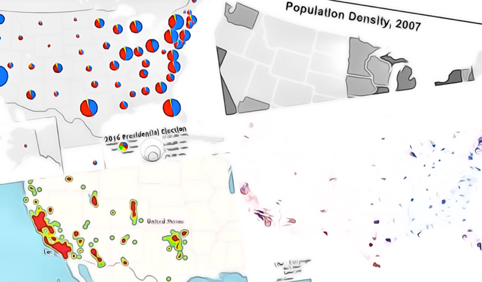

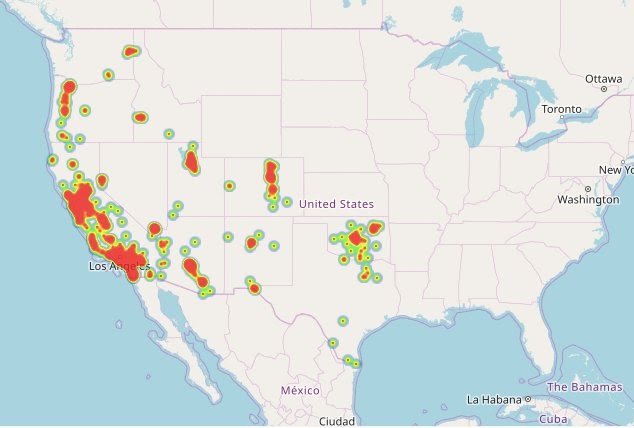


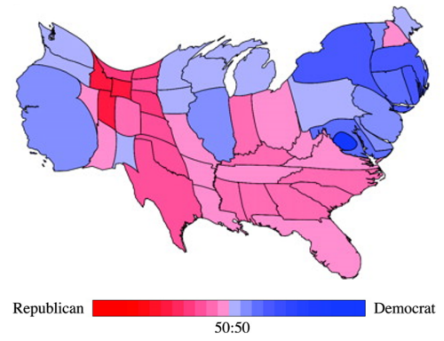

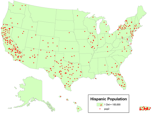


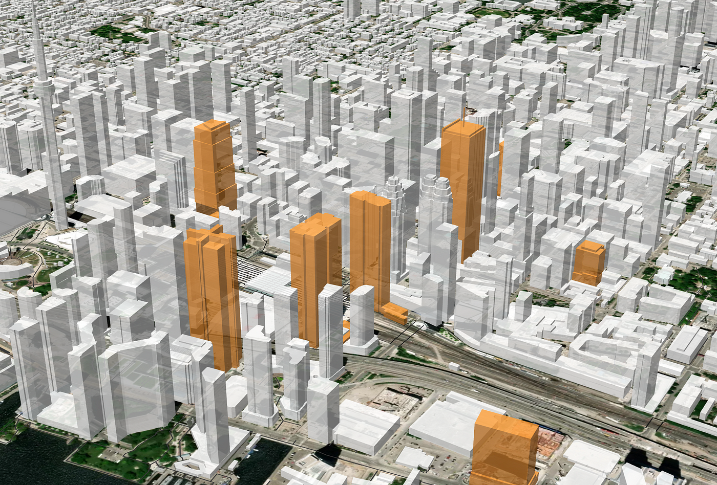


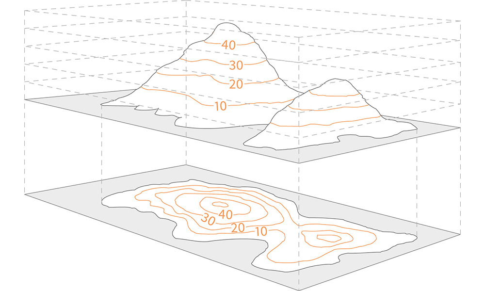

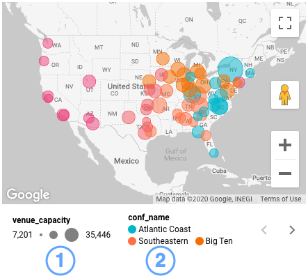


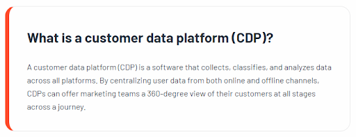

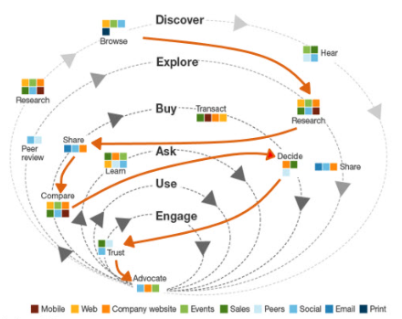

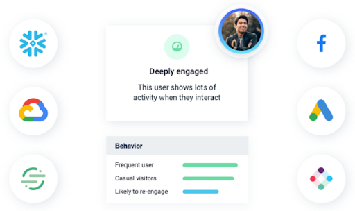


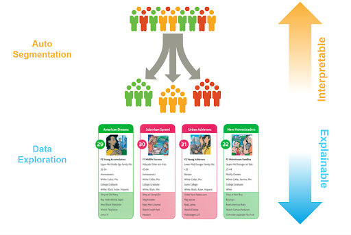

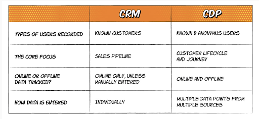


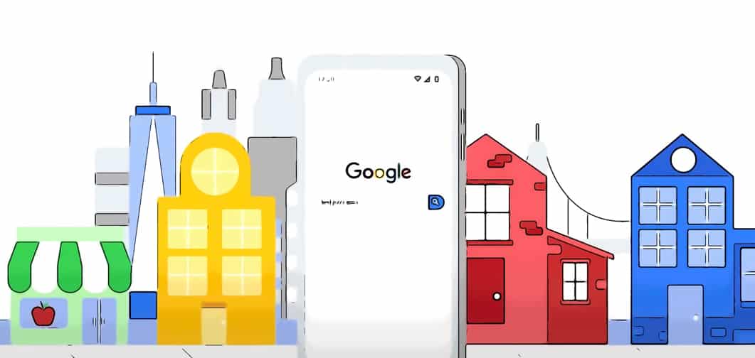

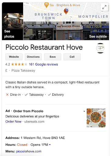


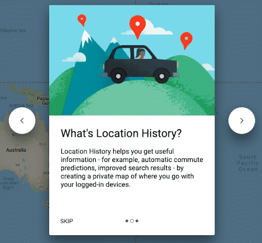


