
Table of Contents
The Importance of Visualizing Geospatial Data
Welcome to the wild and wonderful world of geospatial data visualization! If you’re anything like us, you find that maps just have a certain je ne sais quoi that makes them endlessly fascinating. But let’s be real, maps aren’t just for daydreaming about far-off places. They’re powerful tools for understanding and communicating information about the world around us. And that’s where geospatial data comes in.
At Tamoco,we’re used to map vizualizations with our cutting-edge data collection and analysis techniques. We’re providing high quality data that goes into creating those mesmerizing maps we all love so much.
But whether it’s our data or data from another source, what do you do with it? That’s where visualization comes in, and that’s exactly what we’re here to talk about today.
We’ve scoured the depths of the internet and consulted with experts in the field to bring you a comprehensive list of 20 different methods for visualizing geospatial data on a map. Whether you’re a data scientist, a GIS specialist, or just someone who appreciates a good map, we’ve got something for you.
Method 1: Heat Maps
Alright, a heat map is like a choropleth map’s cooler and more sophisticated cousin. Both use colours or shades to represent different values or value ranges, but where a choropleth map uses discrete cells constrained by geographical or political boundaries, a heat map presents them as a smooth and seamless spectrum.
This makes heat maps perfect for uncovering hot spots and low concentrations of a variable with more precision. But, just like anything worth doing, this precision comes with a price. Heat maps often require converting discrete data points into a continuous spectrum via algorithms, which can compromise on accuracy.
Use case: Smart Cities
Let’s say I’m looking to understand where to build a new cycle lane in a city. By generating commuting data and using it to build a heat map, I can identify hotspots where cyclists will cause a lot of disruption. Using this data, I can see the areas which need alleviating.
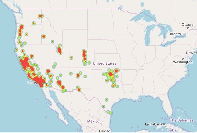
Example of heat maps
This is a great map of the distribution of restaurants across the US.
Method 2: Choropleth Maps
These maps use different shades of colour to represent different values or value ranges within geographical or political boundaries. So, in a nutshell, it’s like a colouring book for data nerds where each country, state, or region gets its own colour.
Creating a choropleth map is a piece of cake. You start with a base map, and then you use different shades of colour to represent different values or value ranges within geographical or political boundaries.
But before you get too excited, it’s important to remember that choropleth maps also have their limitations. They don’t give you any information about the magnitude of the variable, and they can be misleading if the geographical or political boundaries aren’t well-defined. But when used correctly, choropleth maps can be a powerful tool for understanding the distribution of a particular variable within geographical or political boundaries.
Use case: marketing
Let’s say you’re a marketer, and you want to see which states in the US have the highest sales of your product. You could use Tamoco’s data to create a choropleth map that shows the visits to your stores by state. The states with the highest sales would be coloured differently than the states with the lowest sales.
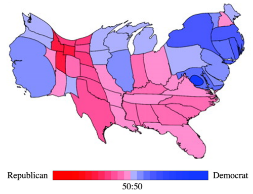
Example of a Choropleth map
The classic example which can be seen below is a population density map.

Method 3: Proportional Symbol Maps
Up next on the geospatial data visualization train is the Proportional Symbol map. These maps use symbols, such as circles or squares, to represent different values or value ranges, and the size of the symbols is proportional to the value of the variable.
Use case: analysis
For example, let’s say you’re a scientist, and you want to see the distribution of a certain species of birds across a region.
You could use a dataset that shows this distribution to create a proportional symbol map that shows the number of sightings of the species by location. The locations with more sightings would have bigger symbols than the locations with fewer sightings.
Proportional symbol maps also have their limitations. They can be misleading if the symbols overlap and they don’t give you any information about the geographical distribution of the variable.
Example of a Proportional Symbol Map
Again it’s a political example where the breakdown of votes in each state are shown by using a pie chart as a symbol on this map of the US.

Method 4: Dot Density Maps
Let’s have a little look at the next visualization type in this post: the Dot Density Map. These maps are used to represent a variable within a certain area. The more dots within an area indicate that the variable is more abundant.
Use case: health
If you work in public health, then you might need to understand the distribution of a disease across a geographical region. You could use Tamoco’s data to create a dot density map that shows the number of cases of the disease by location. The locations with more cases would have more dots than the locations with fewer cases. In this example, The dots can be colour-coded to represent different types of cases, for example, severe or mild cases.
The limitations of this kind of map are usually that they can be misleading if you don’t have enough detail in the map. There is also no magnitude of the variable in a lot of cases.
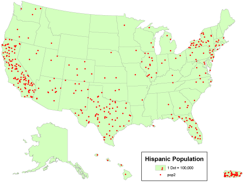
Example of a Dot Density Map

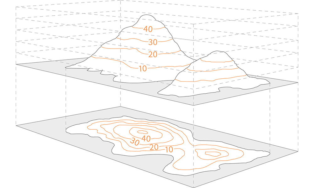
Method 5: Isarithmic Maps
These maps are game changers. They take a little bit of everything and make it into a scrumptious feast for the eyes. It blends the beauty of contour lines with the detail of a choropleth map to give you an explosion of information. The lines represent equal values, and as they get closer, the values get higher. Think of it as a topographical map but more impressive.
Use case: meteorologist
Well, let us imagine you’re a meteorologist, and you want to study the precipitation patterns in your city. With an isarithmic map, you can show the rainfall distribution across the city in an easy-to-understand manner. The closer the lines, the higher the rainfall. It’s a visual representation of the data that brings it to life.
Not only do isarithmic maps make data more digestible, but they also add a touch of artistic flair to your presentations. No longer do you have to stare at boring bar graphs or pie charts. With an isarithmic map, you can show the world’s location or geospatial data in all its splendour.
Example of a Isarithmic map:

Method 6: Flow Maps
Let’s take a look at a real-world example of flow maps in action. Say you’re the CEO of a large logistics company and you want to visualize the shipping patterns of your fleet of trucks. With a flow map, you can plot the origin and destination of each shipment, creating a web of lines that show the routes taken by your trucks. The thicker the line, the more shipments moved along that route. This allows you to easily see the busiest routes, where bottlenecks might be, and where your fleet is most efficiently moving goods.
Use case: logistics
Let’s take a look at a real-world example of flow maps in action. Say you’re the CEO of a large logistics company and you want to visualize the shipping patterns of your fleet of trucks. With a flow map, you can plot the origin and destination of each shipment, creating a web of lines that show the routes taken by your trucks. The thicker the line, the more shipments moved along that route. This allows you to easily see the busiest routes, where bottlenecks might be, and where your fleet is most efficiently moving goods.
Example of a flow map:
Method 7: Density-Equalizing Maps
Have you ever seen a map that looks like a distorted mess, leaving you feeling discombobulated? That’s where Density-Equalizing Maps come in to save the day! These maps make sure that regions with higher density are represented as larger in area, as opposed to just appearing larger because they’re closer to the center.
Use case: city planning
One classic use case of Density-Equalizing Maps is in the field of population demographics. By accurately visualizing areas with higher population density, policy makers and urban planners can make informed decisions about urban development, resource allocation, and emergency preparedness.
Example of a density-equalizing map:
Method 8: Dot Maps
Dot maps are quite beautiful when you think about it. A great representation of multiple data points – that use dots to represent individual parts.
The density of dots in a single location represents the concentration of data points in that area. Each dot represents a single instance of data, so it’s a very, very effective way to visualize the distribution of data.
These maps are even more useful when you have huge amounts of data to understand and want to avoid excess clutter on your map. They are great for visualizing data over a large area, such as a city or country, as they allow you to see patterns and relationships that may not be immediately obvious with other mapping methods. They are also a fantastic way to visualize changes over time, as you can create a series of maps that show the evolution of the distribution of your data.
Use case: store planning (retail)
Let’s say you want to understand every Starbucks in your city. A dot map would be a great way of plotting this on a map. A single dot equals a single Starbucks. The more dots you see in an area, the higher the distribution of Starbucks in the area.
Example of a dot map map:
Method 9: Cartograms
Cartograms are a phenomenal way to visually represent geographical data. Instead of using traditional maps, cartograms distort the size of geographic regions to reflect the magnitude of the data being displayed. Think of it as a funhouse mirror for geospatial/location data, where the size of each region is adjusted to reflect its importance in the data set.
Cartograms provide a unique and fun way to represent geographical data, while still being a powerful tool for visualizing and understanding complex data sets. Whether you’re a data analyst, geographer, or just someone who loves maps, cartograms are sure to add a new dimension to your understanding of the world around you.
Use case: government
An example of a use case for cartograms can be seen in the representation of population data. A population cartogram would adjust the size of each region to reflect the size of its population, with larger regions representing areas with higher populations. This type of representation can quickly bring attention to the areas of the world with the largest populations and help to identify the potential locations for targeted campaigns or resource allocation.
Example of a cartogram map:

Method 10: Hexbin Maps
Now we arrive at the world of Hexbin Maps! Picture a world where data isn’t simply scattered like confetti on a map, but is instead grouped into beautiful, hexagonal shapes. That is the wonder of hexbin mapping.
Hexbin maps, as their name suggests, involve aggregating data into hexagonal bins. This is particularly useful when you have a large volume of data points to represent in a small space, and want to avoid clutter. The size of the hexagons represents the density of data points in a given area.
In a nutshell, hexbin maps are a way to take data overload and turn it into a chic and digestible form. They’re perfect for situations where you have large datasets and want to make quick and easy comparisons between areas
Use case: Tamoco
So, let’s take Tamoco for instance. We collect location data from millions of devices every day. Now, imagine if we had to display the data points for each device on a map. It would be a bit of a mess mess! But, with hexbin maps, we can aggregate the data into hexagons, effectively summarizing the data in a visually appealing and meaningful way.
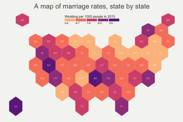
Example of a hexbin map:
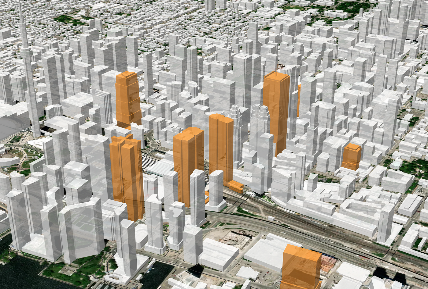
Method 11: 3D Maps
Oh, now we’re getting into some serious geospatial magic. 3D maps take mapping to a whole new dimension (literally!) and can bring a level of realism to your data visualization that’s simply unmatched.
Think about it, with traditional 2D maps, you’re stuck with a flat representation of the world. But with 3D maps, you can now see buildings, terrain, and other features in their actual, three-dimensional form. This allows you to better understand the relationships between various elements and how they interact in the real world.
Use case: real estate
Let’s say you’re a real estate developer and you want to showcase your latest project to potential buyers. You could create a 3D map that allows people to explore the virtual city, walk down the streets, and see the buildings from all angles. This not only gives potential buyers a better sense of the project, but it also provides an immersive, interactive experience that’s simply not possible with 2D maps.
Example of a 3D map:
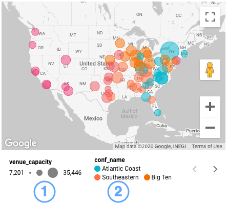
Method 12: Interactive Maps
These maps allow you to explore and interact with data in a way that’s both intuitive and engaging. With interactive maps, you can drill down into the details, play with filters, and uncover hidden patterns and insights. It’s like having your very own personal geospatial detective ready and waiting to solve any mapping mystery.
This is exactly what we provide to many of our clients here at Tamoco. We take complex geospatial data and provide our customers with a detailed interactive map where they can filter and change the view depending on their current needs.
Use case: real estate
For example, imagine you’re a real estate agent with a portfolio of properties. You can use an interactive map to showcase your listings, highlight the best neighborhoods, and provide a wealth of information to potential buyers. With an interactive map, you can easily filter properties by price, location, square footage, and more. This helps you to tailor your pitch and demonstrate why your properties are the best investment. Your clients will love the ability to explore the data for themselves, and you’ll love how it streamlines the sales process.
Example of an interactive map:

Method 13: Graduated Symbol Maps
This method uses graduated symbols to represent the dataset – it assigns different sizes of symbols to different values in the data. This size can be related to a metric of your choice in the datset itself.
These maps are a great way to visualize data that has a large range of values, such as population or income. By using different symbol sizes, you can effectively convey the information without overwhelming the viewer with too much detail.
Use case: government
An example of a use case for graduated symbol maps is to visualize population density in cities. By using graduated symbols, you can see which areas have the highest population density and which areas have the lowest population density. For example, in a city with a high population density, the symbols would be large, while in a city with a low population density, the symbols would be small.
Example of a graduated symbol map:

Method 14: Dasymetric Mapping
It’s time to get a little bit fancy with our maps. Have you ever stumbled upon a choropleth map and thought to yourself, “Well this is nice, but it doesn’t quite capture the real deal”? Enter dasymetric mapping, the map lover’s answer to the choropleth’s limitations.
Dasymetric mapping, also known as “value-by-alpha mapping”, takes the idea of choropleth mapping and adds a little extra oomph by incorporating detailed boundary information to create more accurate and nuanced maps. This method allows you to control the boundaries of your map areas and assign data to specific areas within those boundaries.
At Tamoco, we’ve used dasymetric mapping to help companies better understand the distribution of their customer base. By mapping out population density and overlaying customer data, we’ve been able to identify areas with a high concentration of customers and make more informed decisions about where to open new locations.
Use case: population density
A prime example of where dasymetric mapping can come in handy is when mapping population density. In a typical choropleth map, population density may be portrayed on a large scale, with a single color representing the entire area of a city or even a whole country. But with dasymetric mapping, you can get down to the nitty-gritty by mapping population density at the block or even the building level!
Example of a dasymetric map:

Method 15: Contour Maps
The concept behind these maps is simple – these maps depict changes in elevation with contour lines, much like those you’d see on a topographic map. But why settle for 2D when you can have the whole shabang? With Contour Maps, you can visualize the changes in elevation as a 3D representation of the terrain.
Use case: agriculture
One stellar example of where Contour Maps can be a real game changer is in the world of agriculture. Picture this: you’re a farmer, and you want to maximize the yield of your crops. But, you don’t want to leave anything to chance, you want to know exactly how the elevation of your land affects the growth of your crops. Enter Contour Maps. These bad boys can help you determine the slope of your land, which in turn can help you determine the best irrigation and drainage strategies for your crops. You can even take it a step further and integrate satellite imagery with your Contour Map to get an even more accurate representation of your land.
Example of a contour map:
Method 16: Bubble map
In a nutshell, bubble maps are maps that use bubbles (or circles) to represent data points. The size of the bubble is proportional to the magnitude of the data being represented, while the color and position of the bubble provide additional metadata or information.
Use case:
Bubble maps are an excellent way to showcase data that has both a geographical and a numerical component. For instance, let’s say you’re trying to visualize the distribution of billionaires across the world. You can use bubble maps to show not only where the billionaires are located, but also how many there are in each location. The bigger the bubble, the more billionaires in that area.
Example of a bubble map:
Conclusion: Choosing the Right map for Your Data
Well, that was fun, wasn’t it? A lot of maps for you to dig into, each with its own quirky strengths and charming quirks. But with so many options, how do you choose the right one for your geolocation data?
So let’s start by asking what you’re trying to accomplish. Are you simply looking to display raw location data, or do you want to do something related to footfall to visits? Do you want to highlight patterns and correlations, or are you more interested in conveying information through symbols and shapes?
Once you’ve got a handle on your end goal, consider the data you’re working with. Is it dense or spread out? Does it have many dimensions, or just a few? Do you need to represent change over time or just a snapshot in time?
And finally, think about your audience. Will they be looking at your map on a screen or holding a printout in their hands? Are they data experts, or will they need a little extra guidance to understand your message?
No matter what method you choose, the key is to ensure your map is visually appealing and easy to understand. After all, the most beautiful map in the world is useless if no one can figure out what it’s trying to say.
At Tamoco, we understand the importance of maps and the role they play in visualizing and communicating data. That’s why we offer a wide range of mapping options for you to choose from, each with its own unique style and capabilities.
So why not give Tamoco a try and see what amazing maps you can create with our data today?
James is the head of marketing at Tamoco


